
组件
Callout Blade component
Introduction
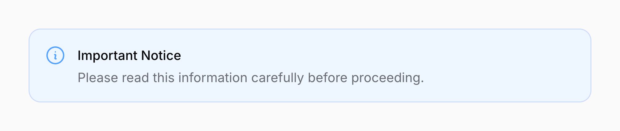
A callout can be used to draw attention to important information or messages:
<x-filament::callout
    icon="heroicon-o-information-circle"
    color="info"
>
    <x-slot name="heading">
        Important Notice
    </x-slot>

    <x-slot name="description">
        Please read this information carefully before proceeding.
    </x-slot>
</x-filament::callout>

Using status colors
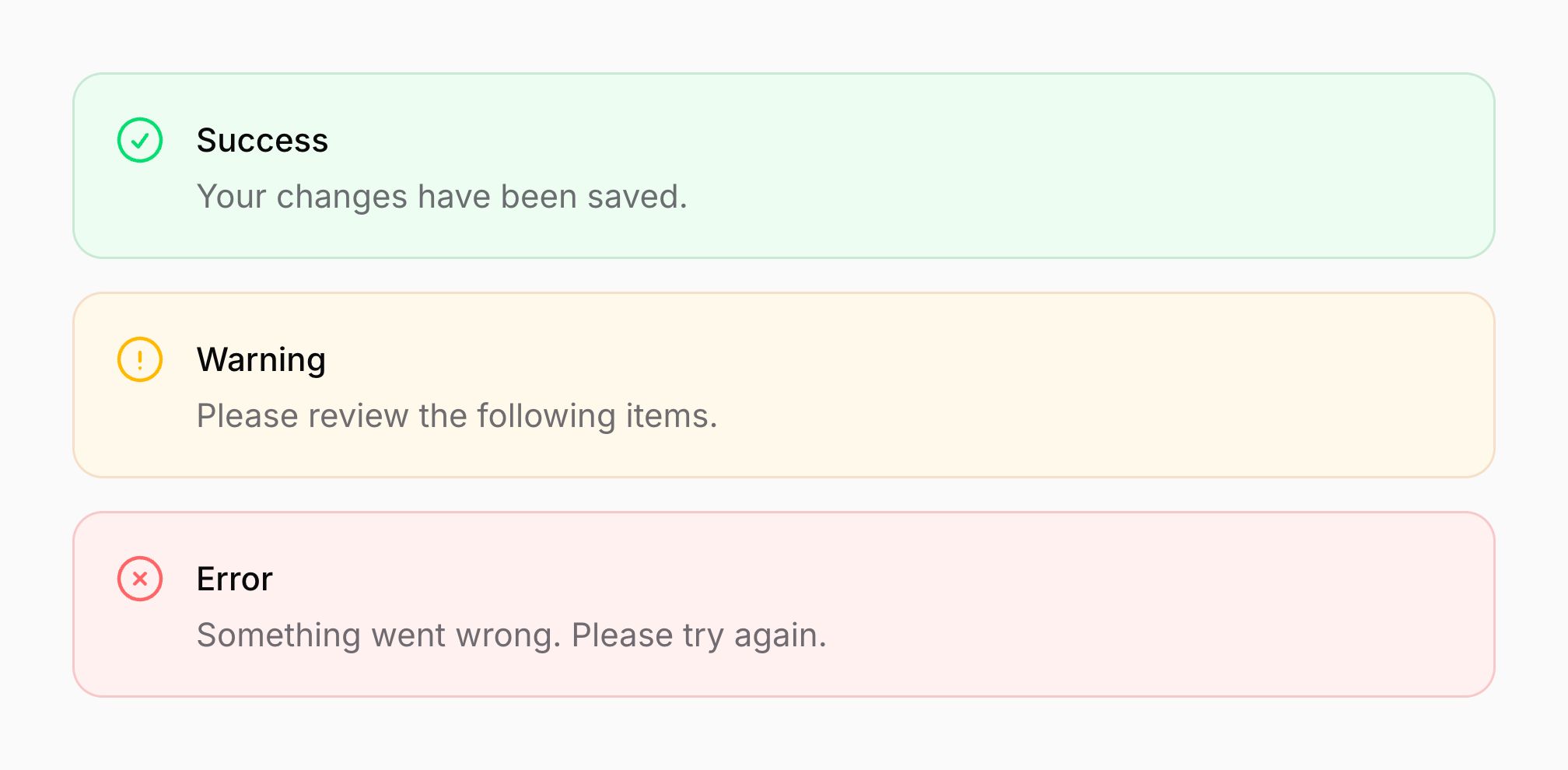
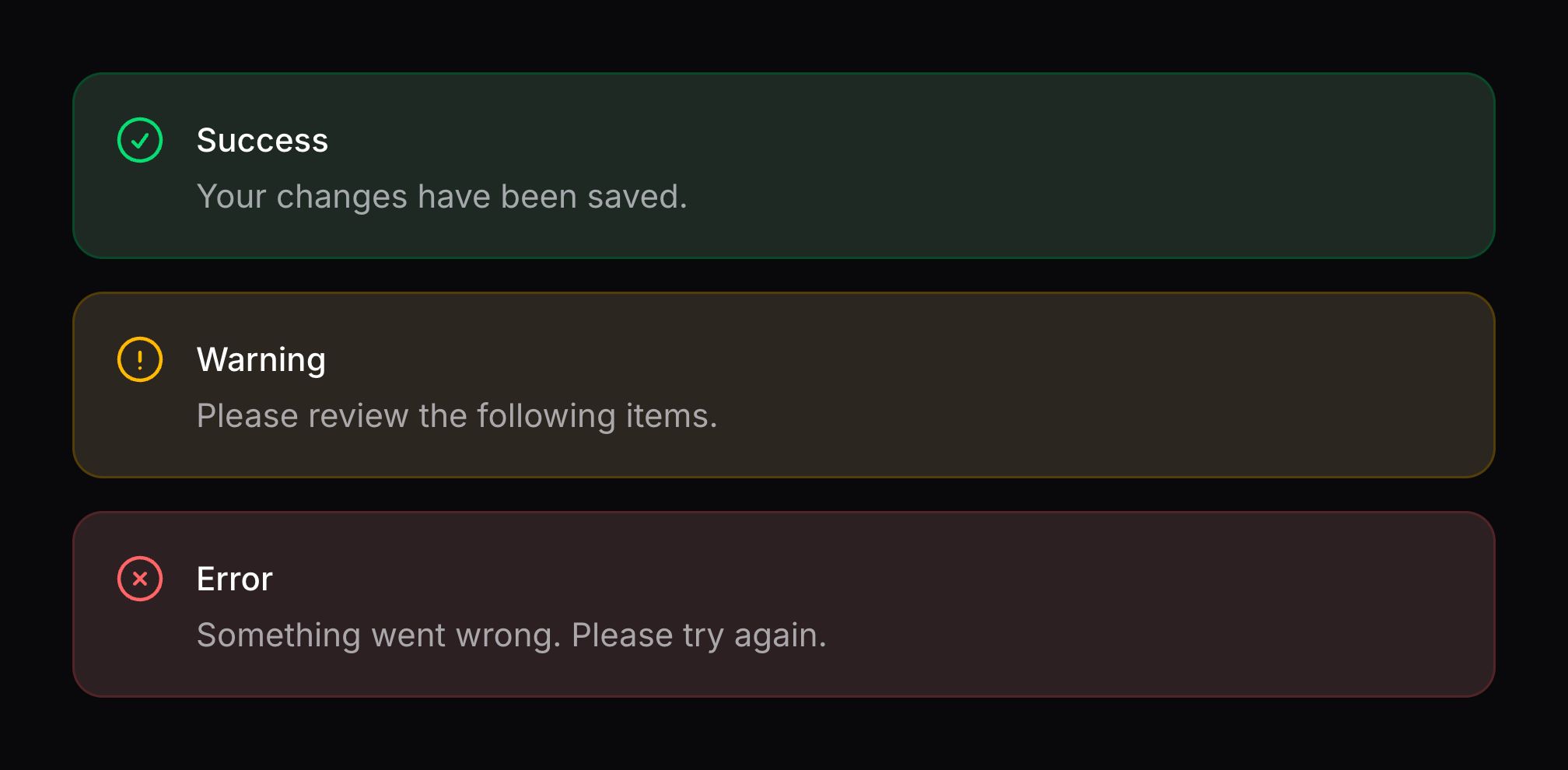
You can set the color attribute to danger, info, success, or warning to create status callouts:
<x-filament::callout
    icon="heroicon-o-x-circle"
    color="danger"
>
    <x-slot name="heading">
        Error
    </x-slot>

    <x-slot name="description">
        Something went wrong. Please try again.
    </x-slot>
</x-filament::callout>

<x-filament::callout
    icon="heroicon-o-information-circle"
    color="info"
>
    <x-slot name="heading">
        Information
    </x-slot>

    <x-slot name="description">
        Here is some helpful information.
    </x-slot>
</x-filament::callout>

<x-filament::callout
    icon="heroicon-o-check-circle"
    color="success"
>
    <x-slot name="heading">
        Success
    </x-slot>

    <x-slot name="description">
        Your changes have been saved.
    </x-slot>
</x-filament::callout>

<x-filament::callout
    icon="heroicon-o-exclamation-circle"
    color="warning"
>
    <x-slot name="heading">
        Warning
    </x-slot>

    <x-slot name="description">
        Please review the following items.
    </x-slot>
</x-filament::callout>
Adding an icon to the callout
You can add an icon to a callout using the icon attribute:
<x-filament::callout icon="heroicon-o-sparkles">
    <x-slot name="heading">
        Tip
    </x-slot>

    <x-slot name="description">
        You can use custom icons for your callouts.
    </x-slot>
</x-filament::callout>


Changing the color of the callout icon
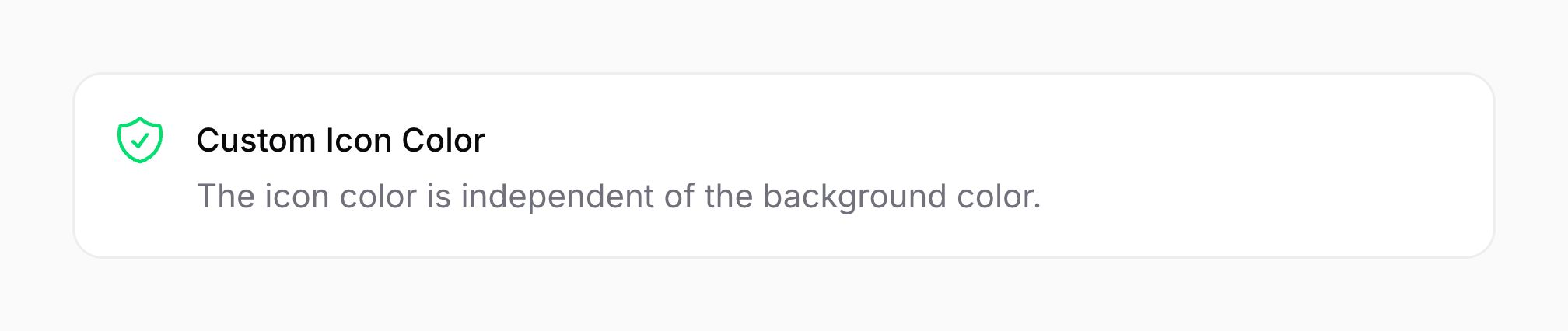
By default, the icon color inherits from the callout’s color. You can override it using the icon-color attribute:
<x-filament::callout
    icon="heroicon-o-shield-check"
    icon-color="success"
>
    <x-slot name="heading">
        Custom Icon Color
    </x-slot>

    <x-slot name="description">
        The icon color is independent of the background color.
    </x-slot>
</x-filament::callout>

Changing the size of the callout icon
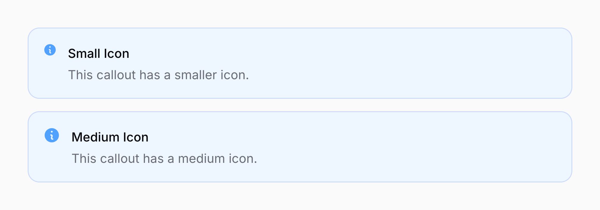
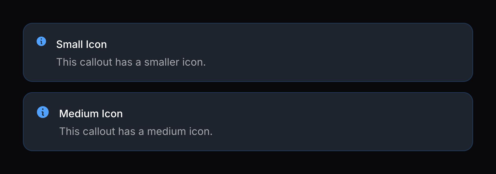
By default, the size of the callout icon is “large”. You can change it to “small” or “medium” using the icon-size attribute:
<x-filament::callout
    icon="heroicon-m-information-circle"
    icon-size="sm"
    color="info"
>
    <x-slot name="heading">
        Small Icon
    </x-slot>

    <x-slot name="description">
        This callout has a smaller icon.
    </x-slot>
</x-filament::callout>

<x-filament::callout
    icon="heroicon-m-information-circle"
    icon-size="md"
    color="info"
>
    <x-slot name="heading">
        Medium Icon
    </x-slot>

    <x-slot name="description">
        This callout has a medium icon.
    </x-slot>
</x-filament::callout>
Using a custom background color
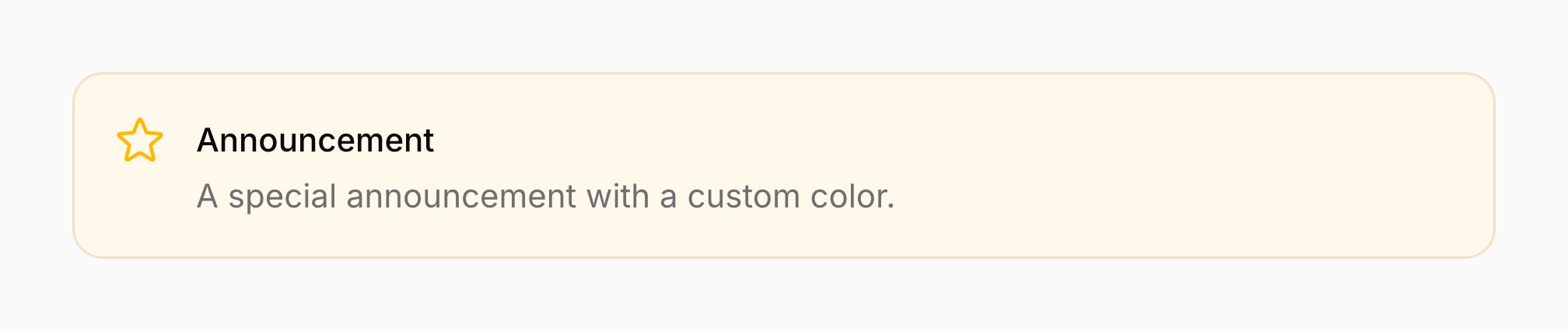
You can set a custom background color using the color attribute with any supported color:
<x-filament::callout
    icon="heroicon-o-star"
    color="primary"
>
    <x-slot name="heading">
        Announcement
    </x-slot>

    <x-slot name="description">
        A special announcement with a custom color.
    </x-slot>
</x-filament::callout>

Adding content to the footer
You can add custom content to the callout footer using the footer slot:
<x-filament::callout
    icon="heroicon-o-check-circle"
    color="success"
>
    <x-slot name="heading">
        System Status
    </x-slot>

    <x-slot name="description">
        All systems are operational.
    </x-slot>

    <x-slot name="footer">
        <span class="text-sm text-gray-500">Last updated: January 15, 2025</span>
    </x-slot>
</x-filament::callout>
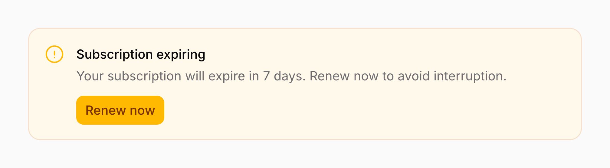
You can also include buttons or other interactive elements in the footer:
<x-filament::callout
    icon="heroicon-o-exclamation-circle"
    color="warning"
>
    <x-slot name="heading">
        Subscription Expiring
    </x-slot>

    <x-slot name="description">
        Your subscription will expire in 7 days.
    </x-slot>

    <x-slot name="footer">
        <x-filament::button size="sm">
            Renew Now
        </x-filament::button>
    </x-slot>
</x-filament::callout>

Adding content to the controls
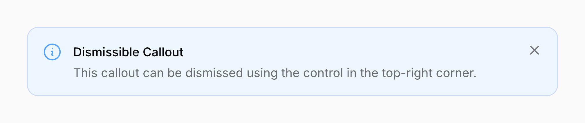
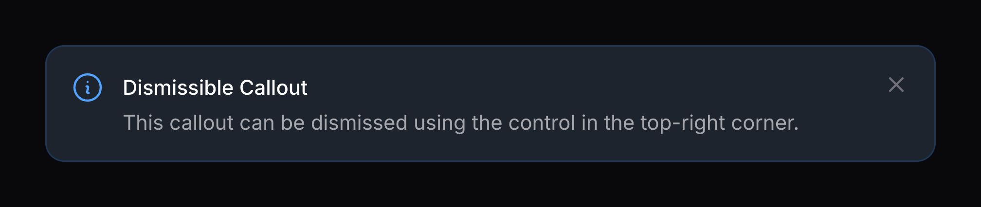
You can add custom content to the callout controls (top-right corner) using the controls slot:
<x-filament::callout
    icon="heroicon-o-information-circle"
    color="info"
>
    <x-slot name="heading">
        Dismissible Callout
    </x-slot>

    <x-slot name="description">
        This callout can be dismissed using the control in the top-right corner.
    </x-slot>

    <x-slot name="controls">
        <x-filament::icon-button
            icon="heroicon-m-x-mark"
            color="gray"
            label="Dismiss"
        />
    </x-slot>
</x-filament::callout>
Callouts without an icon
Callouts can be rendered without an icon if needed:
<x-filament::callout>
    <x-slot name="heading">
        No Icon
    </x-slot>

    <x-slot name="description">
        This callout has no icon.
    </x-slot>
</x-filament::callout>


Callouts with only a heading
Callouts can be used with just a heading, without a description:
<x-filament::callout
    icon="heroicon-o-information-circle"
    color="info"
>
    <x-slot name="heading">
        Simple Notice
    </x-slot>
</x-filament::callout>


Still need help? Join our Discord community or open a GitHub discussion