
自定义样式
颜色
简介
Filament 使用 CSS 变量来定义其调色板。这些 CSS 变量映射到安装 Filament 时加载的预设文件中的 Tailwind 类。Filament 使用 CSS 变量的原因是,它允许框架通过 <style> 元素从 PHP 传递调色板,使之作为 @filamentStyles Blade 指令的一部分渲染。
默认情况下,Filament 的 Tailwind preset 文件自带 6 个颜色:
primary,默认对应于 Tailwind 的amber颜色success,默认对应于 Tailwind 的green颜色warning,默认对应于 Tailwind 的amber颜色danger,默认对应于 Tailwind 的red颜色info,默认对应于 Tailwind 的blue颜色gray,默认对应于 Tailwind 的zinc颜色
如何传递颜色给 Filament
Filament中注册的“颜色”不仅仅是一种色调。事实上,它是由11 个色调组成的整个调色板:50、100、200、300、400、500、600、700、800、900 和 950。当你在 Filament 中使用颜色时,框架将根据上下文决定使用哪种色调。例如,它可能会使用 600 作为组件的背景,500 作为鼠标悬停时的背景,以及 400 作为边框颜色。如果用户启用了暗黑模式,则可能会使用 700、800 或 900。
一方面,这意味着你可以在 Filament 中指定一个颜色,而不必担心使用的确切色调,也不必为组件的每个部分指定色调。Filament 负责选择一种色调,在可能的情况下与其他元素形成可接近的对比。
要自定义 Filament 中某个元素的颜色,可以使用其名称。例如,如果你想使用 success 颜色,你可以将其传递给 PHP 组件的 color 方法,如下所示:
use Filament\Actions\Action;
use Filament\Forms\Components\Toggle;

Action::make('proceed')
    ->color('success')

Toggle::make('is_active')
    ->onColor('success')
如果你想在 Blade 组件中使用某个颜色,可以将其作为属性传递:
<x-filament::badge color="success">
    Active
</x-filament::badge>
自定义默认颜色
在服务提供者的 boot() 方法或者中间件中,你可以调用 FilamentColor::register() 方法,你可以使用该方法自定义 Filament 为 UI 元素使用的颜色。
Filament 中有 6 种默认颜色可供你自定义:
use Filament\Support\Colors\Color;
use Filament\Support\Facades\FilamentColor;

FilamentColor::register([
    'danger' => Color::Red,
    'gray' => Color::Zinc,
    'info' => Color::Blue,
    'primary' => Color::Amber,
    'success' => Color::Green,
    'warning' => Color::Amber,
]);
Color 类包含所有的 Tailwind CSS 颜色以供选择。
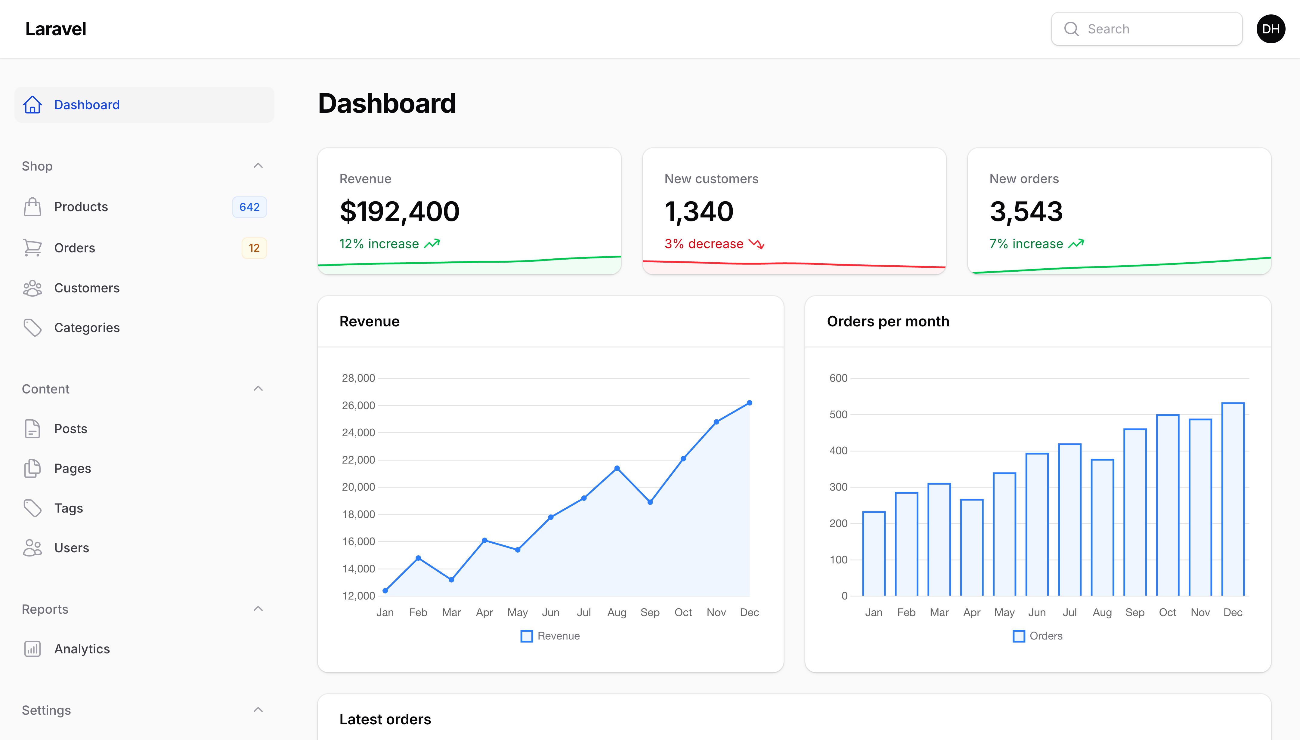
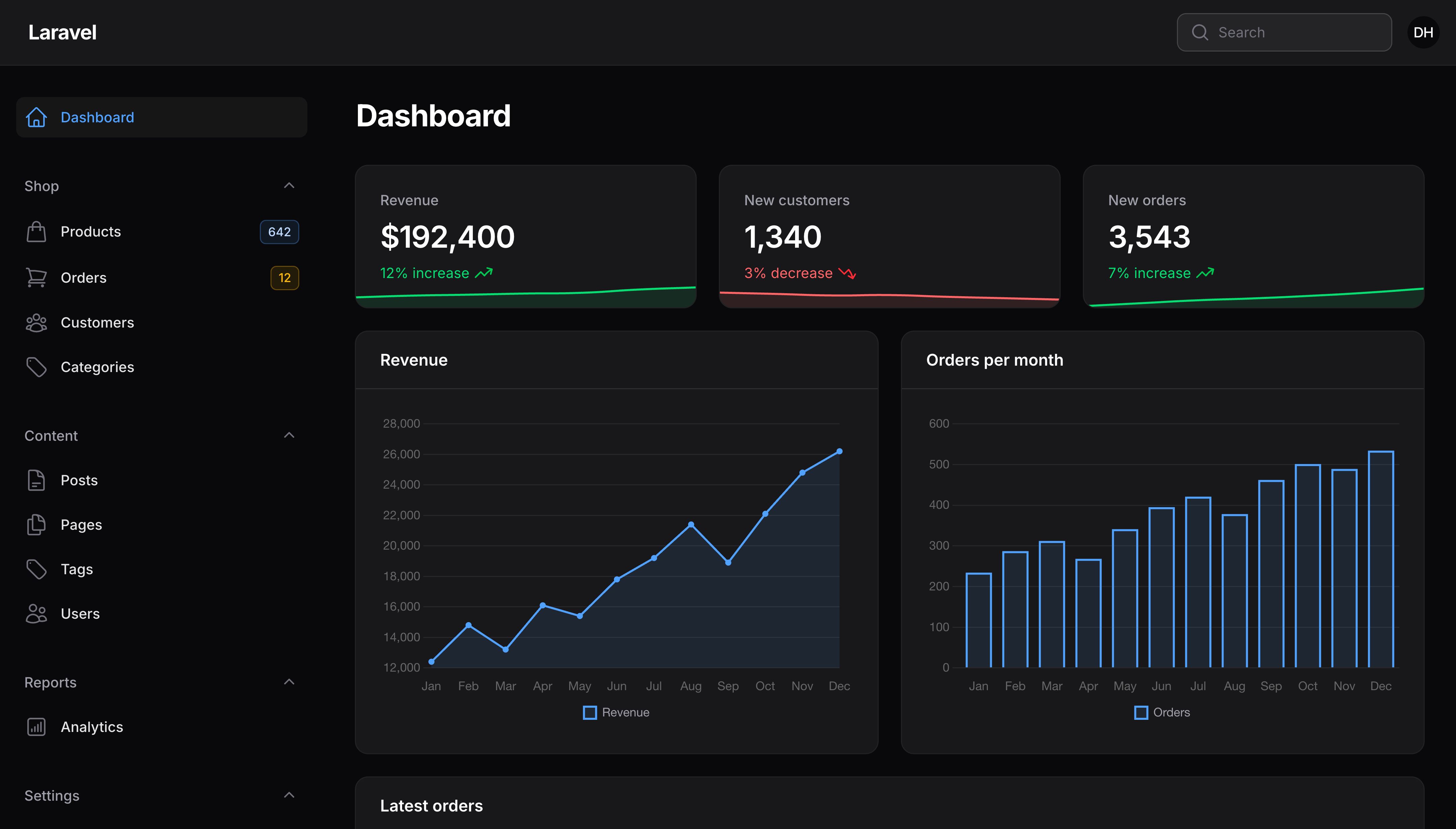
你也可以传入函数到 register() 中,使之只在应用渲染时调用。如果你从服务提供者中调用 register(),并且想要访问比如当前授权用户等对象,这尤其有用,,这些对象稍后将在中间件中初始化。
注册其他颜色
你也可以通过将新颜色传递给 FilamentColor::register() 方法,将其名称作为数组中的键,来注册新颜色以在任何 Filament 组件中使用:
use Filament\Support\Colors\Color;
use Filament\Support\Facades\FilamentColor;

FilamentColor::register([
    'secondary' => Color::Indigo,
]);
现在,你可以在任何 Filament 组件中使用 secondary 作为颜色了。
使用非 Tailwind 颜色
通过传递 OKLCH 格式的从 50 到 950 的色调数组,你可以自定义 Tailwind CSS 颜色调色板中未包含的颜色:
use Filament\Support\Facades\FilamentColor;

FilamentColor::register([
    'danger' => [
        50 => 'oklch(0.969 0.015 12.422)',
        100 => 'oklch(0.941 0.03 12.58)',
        200 => 'oklch(0.892 0.058 10.001)',
        300 => 'oklch(0.81 0.117 11.638)',
        400 => 'oklch(0.712 0.194 13.428)',
        500 => 'oklch(0.645 0.246 16.439)',
        600 => 'oklch(0.586 0.253 17.585)',
        700 => 'oklch(0.514 0.222 16.935)',
        800 => 'oklch(0.455 0.188 13.697)',
        900 => 'oklch(0.41 0.159 10.272)',
        950 => 'oklch(0.271 0.105 12.094)',
    ],
]);
生成自定义调色板
如果你想让我们尝试根据单个十六进制或 RGB 值为你生成调色板,你可以传入:
use Filament\Support\Facades\FilamentColor;

FilamentColor::register([
    'danger' => '#ff0000',
]);

FilamentColor::register([
    'danger' => 'rgb(255, 0, 0)',
]);
How Filament selects accessible shades
When you assign a color to a Filament component (for example ->color('primary')), Filament receives the entire 11-shade palette and decides at runtime which shade to use for the background, text, hover state, dark-mode variants, and so on. The selection is driven by WCAG 2.1 contrast ratios: for each slot, Filament walks the palette and picks the lightest (or darkest, depending on context) shade that meets the minimum contrast against the surface the component sits on.
This design means:
- You only need to register one palette per color name. Per-component shade selection is automatic.
- The same color can render differently across components — a
successbutton uses one bg/text combination, asuccessbadge another — because each component applies contrast rules suited to its visual role. - If you swap a palette out (for example, switching
primaryfrom amber to a darker hue), every component that uses it re-derives its shades to stay accessible.
The contrast thresholds Filament uses come from WCAG 2.1:
- Normal text (
Color::WCAG_AA_TEXT, 4.5:1) — applied to text-bearing components such as buttons, badges, links, dropdown items, and text columns. From success criterion 1.4.3 Contrast (Minimum). - User interface components and graphical objects (
Color::WCAG_AA_NON_TEXT, 3:1) — applied to icon-only components such as icon buttons, toggles, icon columns, and icon entries. From success criterion 1.4.11 Non-text Contrast.
The Filament\Support\Colors\Color class exposes these as constants — WCAG_AA_TEXT, WCAG_AA_LARGE_TEXT, WCAG_AA_NON_TEXT, WCAG_AAA_TEXT, WCAG_AAA_LARGE_TEXT — so you can reference them by name when customizing.
Why some buttons render dark text instead of white
For solid buttons, Filament builds a “best text shade per background shade” lookup up-front, then picks the actual button background by checking which candidate background shades end up paired with light text.
For vibrant colors like red, blue, or indigo, shade 600 is dark enough that white text passes the 4.5:1 contrast threshold. The resolver picks bg: 600, hover:bg: 500, with white text — the path most colors take.
For pale colors like yellow, amber, or lime, even shade 600 is bright enough that dark text passes contrast better than white. The resolver detects this and falls back to a paler background — bg: 400 — paired with dark text. The result is a yellow button with dark text on a light-yellow background, instead of an unreadable white-on-yellow combination.
This behavior is intentional. Forcing every color into the same bg: 600, text: white pattern would produce inaccessible combinations for warm or pale palettes. The two-path design keeps success and danger looking like solid coloured buttons while warning (typically amber) reads correctly with its lighter background.
Customizing shade selection
If you need to override how a particular component picks its shades — for example, to enforce WCAG AAA contrast across the app, or to bias buttons toward darker shades — you can extend the relevant view component and rebind it through Laravel’s container.
Filament exposes three color-map classes for this purpose, all under the Filament\Support\View\Components\ColorMaps namespace. Each follows the same fluent shape — make($palette) to start, chained configuration setters, then get() to return an array<string, int> mapping slot names (such as bg, text, dark:hover:bg) to shade numbers.
The three classes are:
ComponentColorMap— for components that pick one shade per slot, like badges, links, text columns, icons, dropdowns, and toggles.ButtonComponentColorMap— for solid buttons. Picks a background shade and pairs it with a matching text shade.IconButtonComponentColorMap— for icon-only buttons. Picks a single icon shade and derives a hover variant from it.
Components you can override
Every Filament component that picks shades from a palette implements getColorMap(). To customize one, extend the class, override getColorMap(), and bind your subclass through Laravel’s container.
| Component class | Used by | Documentation |
|---|---|---|
Filament\Support\View\Components\BadgeComponent | Badges | Badge |
Filament\Support\View\Components\ButtonComponent | Buttons (solid and outlined) | Button |
Filament\Support\View\Components\IconButtonComponent | Icon-only buttons | Icon button |
Filament\Support\View\Components\LinkComponent | Links | Link |
Filament\Support\View\Components\ToggleComponent | Form toggle | Toggle |
Filament\Support\View\Components\DropdownComponent\HeaderComponent | Dropdown headers | Dropdown |
Filament\Support\View\Components\DropdownComponent\ItemComponent | Dropdown items | Dropdown |
Filament\Schemas\View\Components\TextComponent | Schema text primes | Prime components |
Filament\Infolists\View\Components\TextEntryComponent\ItemComponent | Infolist text entries | Text entry |
Filament\Infolists\View\Components\IconEntryComponent\IconComponent | Infolist icon entries | Icon entry |
Filament\Tables\View\Components\Columns\TextColumnComponent\ItemComponent | Table text columns | Text column |
Filament\Tables\View\Components\Columns\IconColumnComponent\IconComponent | Table icon columns | Icon column |
Filament\Tables\View\Components\Columns\Summarizers\CountComponent\IconComponent | Table count summarizers | Summaries |
Filament\Widgets\View\Components\StatsOverviewWidgetComponent\StatComponent\DescriptionComponent | Stats overview widget descriptions | Stats overview |
TIP
The fastest way to write a custom getColorMap() is to copy the original implementation from the class you’re overriding and tweak the configuration values. The source files live alongside the documented classes in packages/<package>/src/View/Components/. Each one is a few lines of fluent calls — the easiest way to learn the surface is to read the default and change it.
ComponentColorMap
Builds a slot map one entry at a time. Call slot() once per output slot, then get().
use Filament\Support\Colors\Color;
use Filament\Support\Facades\FilamentColor;
use Filament\Support\View\Components\ColorMaps\ComponentColorMap;

$gray = FilamentColor::getColor('gray');

ComponentColorMap::make($color)
    ->slot('text', surface: $gray[50], minRatio: Color::WCAG_AA_TEXT, fallback: 900)
    ->slot('dark:text', surface: $gray[700], maxShade: 500, shouldStartFromDarkest: true, fallback: 200)
    ->get();
slot() parameters:
$name— Output map key (text,bg,hover:text,dark:hover:bg, etc.).$surface— The color the chosen shade must contrast against (typically$gray[50],$gray[700], or'oklch(1 0 0)').$minRatio— Minimum WCAG contrast ratio. Defaults toColor::WCAG_AA_TEXT(4.5); useWCAG_AA_NON_TEXT(3.0) for icons orWCAG_AAA_TEXT(7.0) for AAA.$maxShade— Optional upper bound on the shade number considered.$minShade— Optional lower bound.$shouldStartFromDarkest— Walk darkest→lightest instead of the default lightest→darkest. Use for dark-mode lookups.$fallback— Shade returned when no candidate qualifies. Typically900for light mode,200for dark mode.
ButtonComponentColorMap
Returns all eight slots a solid button needs (bg, hover:bg, dark:bg, dark:hover:bg, text, hover:text, dark:text, dark:hover:text) from one get() call. You configure which background shades to use; the matching text shade for each is found automatically. At least one lightBackground() and one darkBackground() are required.
use Filament\Support\Colors\Color;
use Filament\Support\View\Components\ColorMaps\ButtonComponentColorMap;

ButtonComponentColorMap::make($color)
    ->minContrastRatio(Color::WCAG_AA_TEXT)
    ->lightBackground(bg: 600, hover: 500)
    ->lightBackground(bg: 400, hover: 300, alternateHover: 500)
    ->darkBackground(bg: 600, hover: 500, alternateHover: 700)
    ->get();
minContrastRatio() sets the minimum WCAG ratio between bg and text. Defaults to Color::WCAG_AA_TEXT (4.5); set to WCAG_AAA_TEXT (7.0) for AAA.
lightBackground() and darkBackground() share the same shape (bg, hover, alternateHover?) and the same selection algorithm — they differ only in which mode they configure. Each call appends a candidate to the list for that mode, evaluated in order using two passes:
- Preferred — walk the list and stop at the first candidate whose
bgproduces light text. For that candidate, usehoverif it also produces light text; otherwise usealternateHoverif it produces light text; otherwise skip. - Fallback — if nothing qualified in pass 1, take the last candidate. Hover is
hoverwhen its text-lightness is consistent withbg’s, otherwisealternateHover. The consistency check avoids a text-color flicker on hover.
alternateHover is treated identically on any candidate — first, last, or middle. It’s only consulted when the main hover isn’t appropriate.
To express a color-aware cascade — “use 800 if the palette can carry it, otherwise 700, otherwise 600, falling back to a paler bg with dark text for yellows” — chain candidates and end with a pale-friendly fallback:
ButtonComponentColorMap::make($color)
    ->lightBackground(bg: 800, hover: 700)
    ->lightBackground(bg: 700, hover: 600)
    ->lightBackground(bg: 600, hover: 500)
    ->lightBackground(bg: 400, hover: 300, alternateHover: 500) // pale fallback
    ->darkBackground(bg: 600, hover: 500, alternateHover: 700)
    ->get();
NOTE
The last candidate doubles as the fallback when no candidate produces light text on its bg. If you configure only vibrant-friendly candidates and your palette is pale, that last candidate is used anyway — likely producing a dark-text-on-dark-bg button. Always end with a pale-friendly candidate (typically bg around 400) to handle yellows, ambers, and limes.
IconButtonComponentColorMap
Returns the four icon slots (text, hover:text, dark:text, dark:hover:text) for icon-only buttons. Hover variants are derived from the resting shade by a fixed 100-shade offset that intensifies the icon. At least one lightSurface() and one darkSurface() are required.
use Filament\Support\Colors\Color;
use Filament\Support\Facades\FilamentColor;
use Filament\Support\View\Components\ColorMaps\IconButtonComponentColorMap;

$gray = FilamentColor::getColor('gray');

IconButtonComponentColorMap::make($color)
    ->minContrastRatio(Color::WCAG_AA_NON_TEXT)
    ->lightSurface($gray[50])
    ->darkSurface($gray[700])
    ->darkMaxShade(500)
    ->get();
minContrastRatio()— Minimum contrast ratio between icon and surface. Defaults toColor::WCAG_AA_NON_TEXT(3.0).lightSurface()/darkSurface()— The body surface color the icon must contrast against in each mode. Typically$gray[50]and$gray[700].darkMaxShade()— Upper bound on the shade considered for dark-mode icon color. Defaults to500; lower for lighter icons.
Worked example: AAA contrast for buttons
Here is a complete subclass that enforces WCAG AAA contrast on solid buttons and biases the background choice toward darker shades:
namespace App\View\Components;

use Filament\Support\Colors\Color;
use Filament\Support\Facades\FilamentColor;
use Filament\Support\View\Components\ButtonComponent as BaseButtonComponent;
use Filament\Support\View\Components\ColorMaps\ButtonComponentColorMap;
use Filament\Support\View\Components\ColorMaps\ComponentColorMap;

class ButtonComponent extends BaseButtonComponent
{
    public function getColorMap(array $color): array
    {
        $gray = FilamentColor::getColor('gray');

        if ($this->isOutlined) {
            return ComponentColorMap::make($color)
                ->slot('text', surface: $gray[50], minRatio: Color::WCAG_AAA_TEXT, fallback: 900)
                ->slot('dark:text', surface: $gray[700], minRatio: Color::WCAG_AAA_TEXT, maxShade: 500, shouldStartFromDarkest: true, fallback: 200)
                ->get();
        }

        return ButtonComponentColorMap::make($color)
            ->minContrastRatio(Color::WCAG_AAA_TEXT)
            ->lightBackground(bg: 700, hover: 600)
            ->lightBackground(bg: 400, hover: 300, alternateHover: 500)
            ->darkBackground(bg: 600, hover: 500, alternateHover: 700)
            ->get();
    }
}
Bind your subclass in a service provider’s register() method:
use App\View\Components\ButtonComponent;
use Filament\Support\View\Components\ButtonComponent as BaseButtonComponent;

public function register(): void
{
    $this->app->bind(BaseButtonComponent::class, ButtonComponent::class);
}
The same pattern works for any of the components listed above — extend, override getColorMap(), and bind.
TIP
The defaults work for the overwhelming majority of palettes. Only override these classes if you have specific accessibility requirements (such as AAA compliance) or a design system that mandates different shade preferences.
Still need help? Join our Discord community or open a GitHub discussion