
自定义样式
概述
修改颜色
在配置中,你可以修改使用的颜色。Filament 自带 6 个在框架中使用的预制颜色。他们可以定义如下:
use Filament\Panel;
use Filament\Support\Colors\Color;

public function panel(Panel $panel): Panel
{
    return $panel
        // ...
        ->colors([
            'danger' => Color::Rose,
            'gray' => Color::Gray,
            'info' => Color::Blue,
            'primary' => Color::Indigo,
            'success' => Color::Emerald,
            'warning' => Color::Orange,
        ]);
}
Filament\Support\Colors\Color 类包含所有 Tailwind CSS 调色板中的颜色选项。
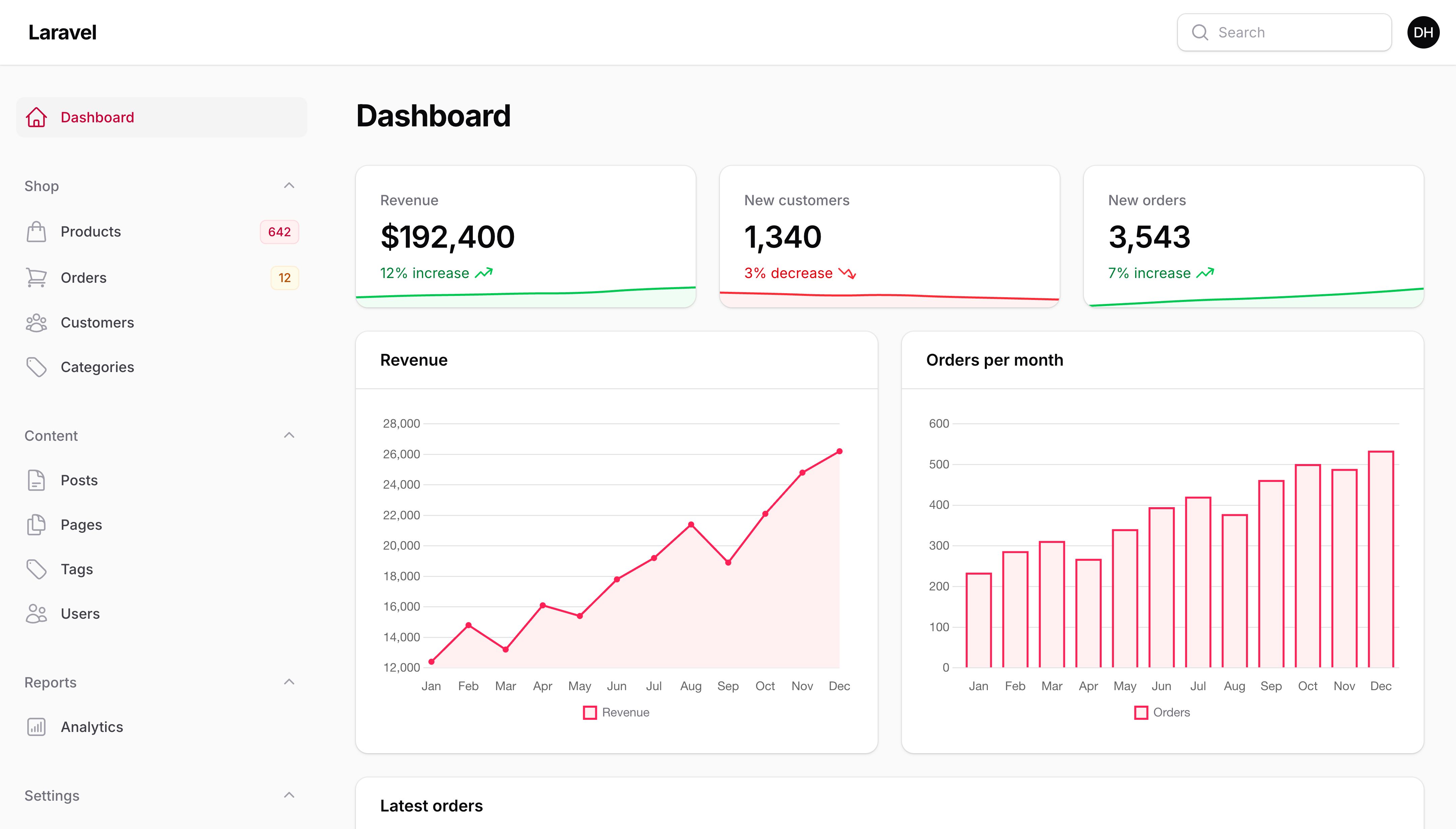
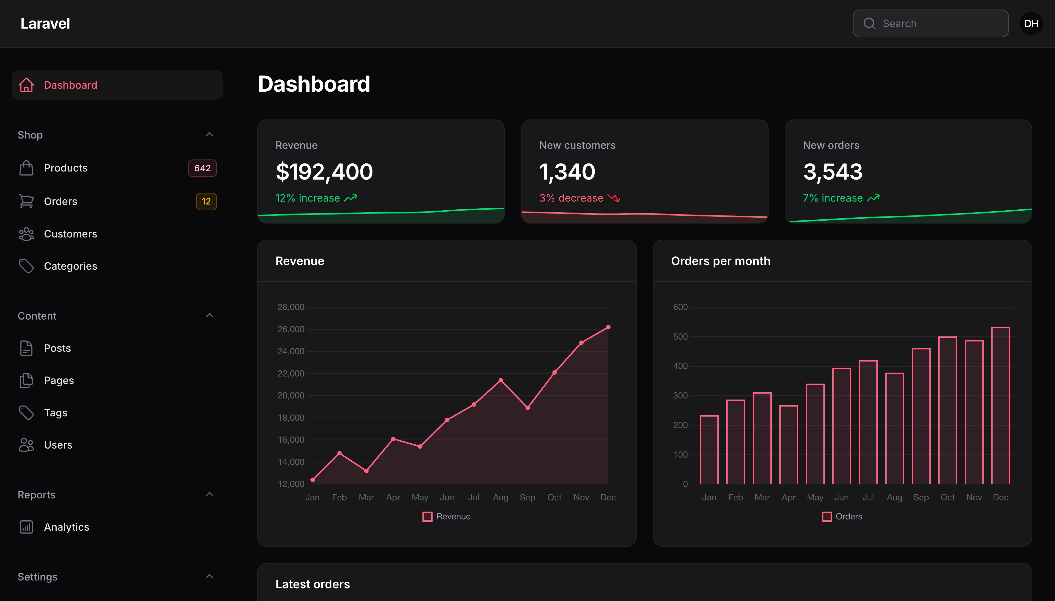
你也可以传递函数到 register(),该函数只有当应用渲染时才会调用。如果你在服务提供者中调用 register(),并且希望比如访问当前经过身份验证的用户等对象,这将非常有用,它们稍后将在中间件中初始化。
此外,你可以以 OKLCH 颜色数组的方式传入你自己的调色板:
$panel
    ->colors([
        'primary' => [
            50 => 'oklch(0.969 0.015 12.422)',
            100 => 'oklch(0.941 0.03 12.58)',
            200 => 'oklch(0.892 0.058 10.001)',
            300 => 'oklch(0.81 0.117 11.638)',
            400 => 'oklch(0.712 0.194 13.428)',
            500 => 'oklch(0.645 0.246 16.439)',
            600 => 'oklch(0.586 0.253 17.585)',
            700 => 'oklch(0.514 0.222 16.935)',
            800 => 'oklch(0.455 0.188 13.697)',
            900 => 'oklch(0.41 0.159 10.272)',
            950 => 'oklch(0.271 0.105 12.094)',
        ],
    ])
生成调色板
如果你想让我们尝试根据单个十六进制或 RGB 值为你生成调色板,你可以传入:
$panel
    ->colors([
        'primary' => '#6366f1',
    ])

$panel
    ->colors([
        'primary' => 'rgb(99, 102, 241)',
    ])
修改字体
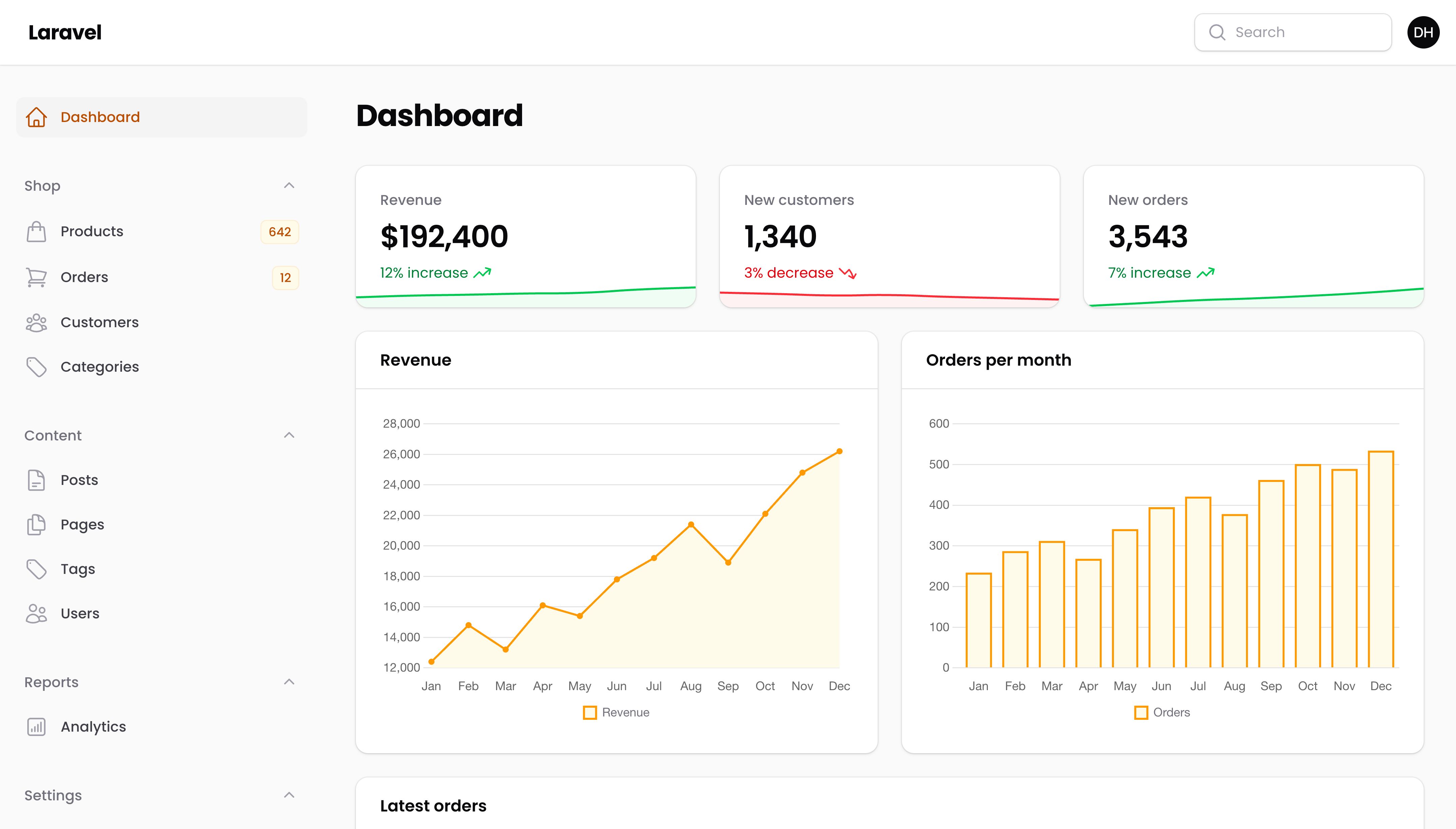
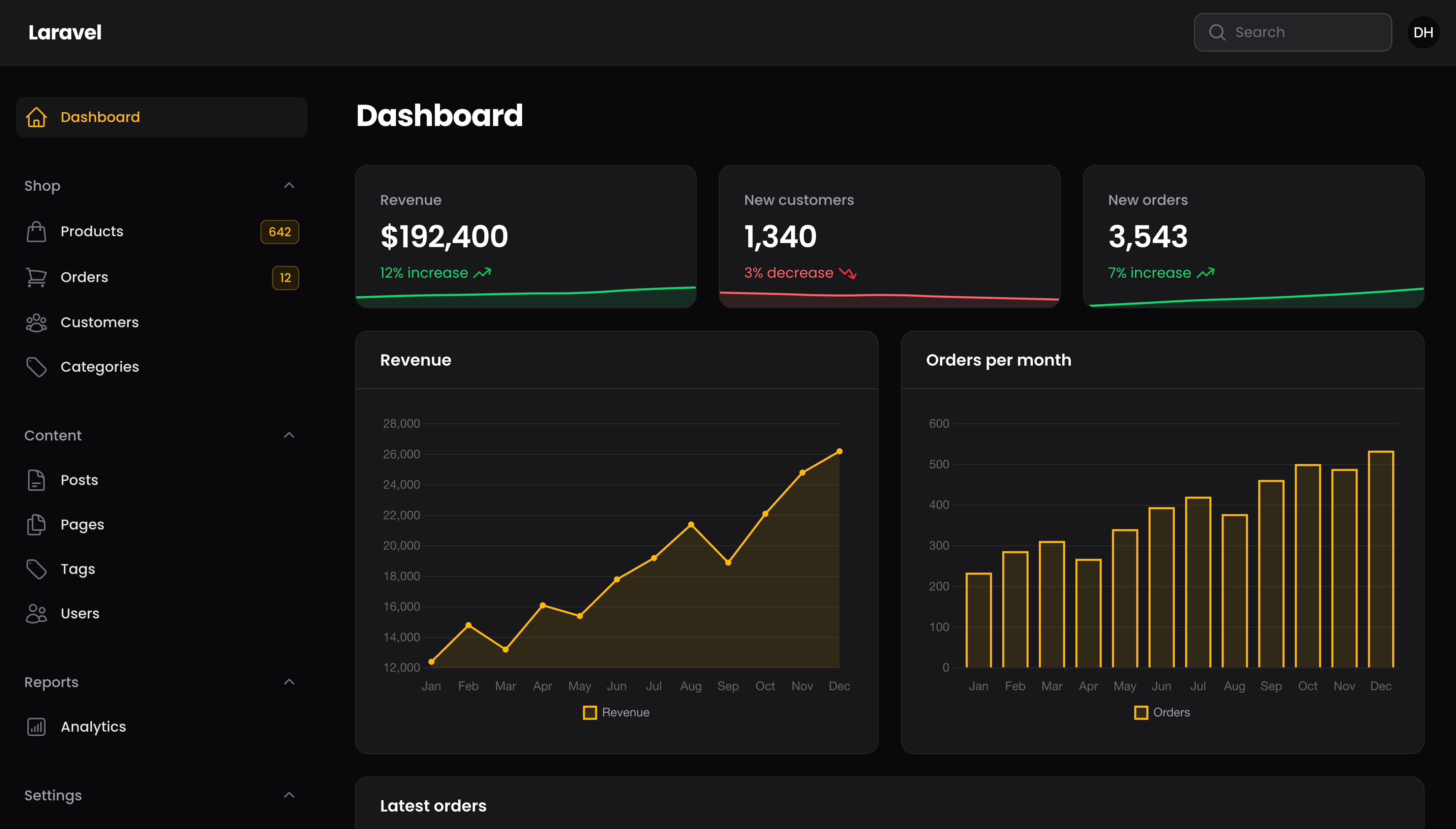
默认情况下,我们使用 Inter 字体。你可以在配置文件中使用 font()方法修改:
use Filament\Panel;

public function panel(Panel $panel): Panel
{
    return $panel
        // ...
        ->font('Poppins');
}
所有的 Google 字体都是可以使用的。
修改字体提供者
Bunny Fonts CDN 用于提供字体。它符合 GDPR 标准。如果你想使用 Google Fonts CDN 替换,可以使用 font() 方法的 provider 参数进行修改:
use Filament\FontProviders\GoogleFontProvider;

$panel->font('Inter', provider: GoogleFontProvider::class)
或者如果你想在本地样式表中提供字体,你可以使用 LocalFontProvider:
use Filament\FontProviders\LocalFontProvider;

$panel->font(
    'Inter',
    url: asset('css/fonts.css'),
    provider: LocalFontProvider::class,
)
创建自定义主题
通过编译自定义样式表替换默认样式表,Filament 允许你修改用于渲染 UI 的 CSS。自定义样式表被称为“主题”。主题使用 Tailwind CSS。
要为面板创建自定义主题,你可以使用 php artisan make:filament-theme 命令:
php artisan make:filament-theme
如果你由多个面板,你可以指定你想要创建主题的面板:
php artisan make:filament-theme admin
默认情况下,该命令将使用 NPM 来安装依赖。如果你想使用不同的包管理器,可以使用 --pm 选项:
php artisan make:filament-theme --pm=bun
该命令将会:
- 安装需要的 Tailwind CSS 依赖
- 生成 CSS 文件:
resources/css/filament/{panel}/theme.css - 尝试自动添加主题到你的
vite.config.jsinput 数组 - 尝试在面板提供者中自动注册
->viteTheme() - 使用 Vite 编译主题
如果该命令无法自动配置你的文件(由于格式不标准),它将显示手动指示。在这种情况下,请按照以下步骤操作:
手动配置
在 vite.config.js 中将主题 CSS 文件添加到的 Laravel 插件的 input 数组:
input: [
    // ...
    'resources/css/filament/admin/theme.css',
]
在面板提供者中注册 Vite 编译的 CSS 主题文件:
use Filament\Panel;

public function panel(Panel $panel): Panel
{
    return $panel
        // ...
        ->viteTheme('resources/css/filament/admin/theme.css');
}
然后使用 Vite 编译主题:
npm run build
NOTE
检查命令输出中的确切文件路径(例如 admin/theme.css),因为它可能因面板的 ID 而异。
现在你可以通过编辑 resources/css/filament 中的 CSS 文件自定义主题。
在 Blade 视图或者 PHP 文件中使用 Tailwind CSS 类
NOTE
A custom theme is required to use Tailwind CSS classes in your own code. Filament’s default compiled stylesheet does not include arbitrary Tailwind classes - it only contains the styles needed for Filament’s own UI components.
如果你想在自己的 Blade 视图、Livewire 组件或 PHP 文件中使用 Tailwind CSS 实用类(如text-primary-600、bg-gray-100 、p-4等),你必须先创建一个自定义主题。
如果没有自定义主题,任何添加到代码中的 Tailwind 类都将无法工作——这些样式将不会被应用,因为它们没有包含在编译的 CSS 中。
为你的项目设置 Tailwind CSS
要在项目中使用 Tailwind CSS 类,你需要设置自定义主题以在面板中自定义编译过的 CSS 文件。运行如下命令:
php artisan make:filament-theme
在生成的的 theme.css 文件中,你将看到这两行:
@source '../../../../app/Filament';
@source '../../../../resources/views/filament';
在使用 Tailwind 类的地方添加你自己的目录。比如:
@source '../../../../app/Filament/**/*';
@source '../../../../resources/views/filament/**/*';
@source '../../../../resources/views/components/**/*';
@source '../../../../resources/views/livewire/**/*';
@source '../../../../app/Livewire/**/*';
添加完这些目录后,重新编译主题:
npm run build
你可以在 Tailwind CSS 文档中学习更多关于 @source 指令的内容。
暗黑模式
默认情况下,Filament 允许用户在轻亮模式和暗黑模式之间切换。以下章节将介绍如何自定义此行为:
禁用暗黑模式
要禁用暗黑模式的切换,你可以在配置文件中设置:
use Filament\Panel;

public function panel(Panel $panel): Panel
{
    return $panel
        // ...
        ->darkMode(false);
}
隐藏主题切换器
默认情况下,用户可以使用用户菜单中的主题切换器在轻亮模式和暗黑模式之间切换。如果你想保持暗黑模式启用,但阻止用户手动切换(以便 Filament 遵循默认主题模式或用户的系统偏好),你可以使用 themeSwitcher(false) 方法隐藏主题切换器:
use Filament\Panel;

public function panel(Panel $panel): Panel
{
    return $panel
        // ...
        ->themeSwitcher(false);
}
NOTE
这不同于 darkMode(false),它完全禁用了暗黑模式。themeSwitcher(false) 隐藏了切换按钮但保留了暗黑模式。
强制暗黑模式
如果你想强制面板始终使用暗黑模式,无论用户偏好,你可以传递 isForced: true 到 darkMode() 方法中。这将同时隐藏主题切换按钮:
use Filament\Panel;

public function panel(Panel $panel): Panel
{
    return $panel
        // ...
        ->darkMode(isForced: true);
}
修改默认主题模式
默认情况下,Filament 使用用户的系统主题作为默认模式。比如,如果用户电脑使用的是暗黑模式,Filament 将会默认使用暗黑模式。如果用户修改电脑中的模式,Filament 中的系统模式是响应式的。如果你想修改默认模式使之强制使用清亮模式或者暗黑模式,请使用 defaultThemeMode() 方法,并传入 ThemeMode::Light 或者 ThemeMode::Dark:
use Filament\Enums\ThemeMode;
use Filament\Panel;

public function panel(Panel $panel): Panel
{
    return $panel
        // ...
        ->defaultThemeMode(ThemeMode::Light);
}
添加图标
默认情况下,Filament 使用你的应用名渲染一个基于文本的简单 Logo。不过,你可以对其进行自定义。
如果你只想要修改 Logo 使用文本,你可以使用 brandName() 方法:
use Filament\Panel;

public function panel(Panel $panel): Panel
{
    return $panel
        // ...
        ->brandName('Filament Demo');
}
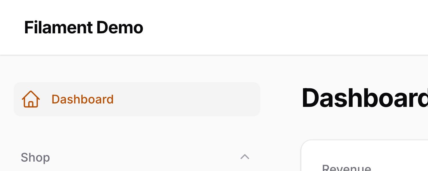
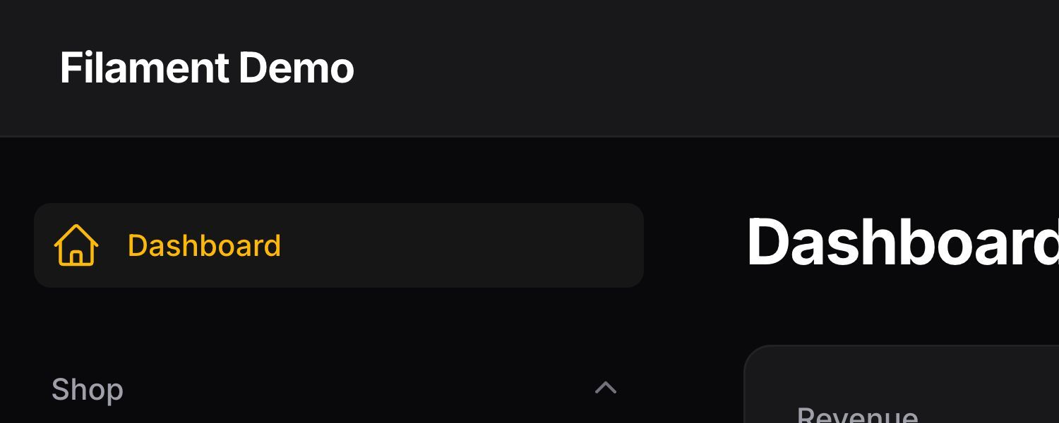
要替换成渲染图片,请传入 URL 到 brandLogo() 方法:
use Filament\Panel;

public function panel(Panel $panel): Panel
{
    return $panel
        // ...
        ->brandLogo(asset('images/logo.svg'));
}
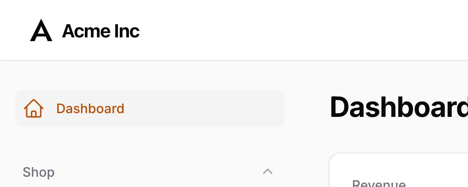
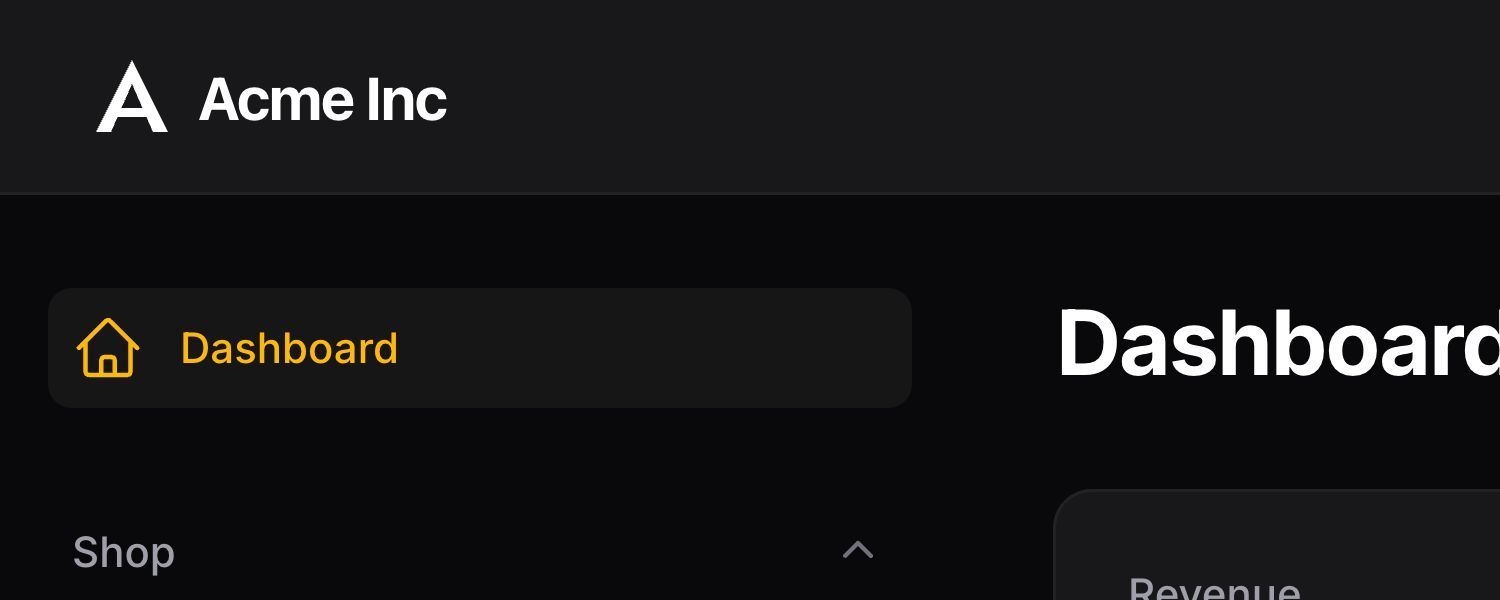
此外,你可以直接传递 HTML 到 brandLogo() 方法,以渲染行内 SVG 元素:
use Filament\Panel;

public function panel(Panel $panel): Panel
{
    return $panel
        // ...
        ->brandLogo(fn () => view('filament.admin.logo'));
}
<svg
    viewBox="0 0 128 26"
    xmlns="http://www.w3.org/2000/svg"
    class="h-full fill-gray-500 dark:fill-gray-400"
>
    <!-- ... -->
</svg>
如果暗黑模式下,你想使用不同的 Logo, 你可以以相同的方式将其传入到 darkModeBrandLogo() 方法中。
Logo 高度默认是一个合理值,但不可能考虑所有可能的纵横比。因此,你可以使用 brandLogoHeight() 方法自定义要渲染的 Logo 的高度:
use Filament\Panel;

public function panel(Panel $panel): Panel
{
    return $panel
        // ...
        ->brandLogo(fn () => view('filament.admin.logo'))
        ->brandLogoHeight('2rem');
}
添加 favicon
要添加 favicon,你可以使用配置,并传入 favicon 的公开 URL:
use Filament\Panel;

public function panel(Panel $panel): Panel
{
    return $panel
        // ...
        ->favicon(asset('images/favicon.png'));
}
让面板更加紧凑
数据密集型面板在表和控件使用较少的空间时,更容易扫描。紧凑主题提供了一个现成的选项,可以减少整个面板的间距,同时保留 Filament 的默认移动端间距。如果你想改变视觉风格和密度,它也可以与 Sharp、Soft 和 Noir 主题结合使用。
如果你只需要让一些元素更紧凑,你可以在你的自定义主题中添加有针对性的规则。例如,这些规则减少了表格文本单元格的垂直填充和较大屏幕上默认大小按钮的填充:
.fi-ta-text:not(.fi-inline) {
    @apply sm:py-2;
}

.fi-btn {
    @apply sm:px-2.5 sm:py-1.5;
}
使用 sm 断点让 Filament 的默认空间保持在小型屏幕中,这样表格行将以堆叠内容常态化展示。你可以使用 CSS 钩子类以同样的方式锁定其他元素。
Still need help? Join our Discord community or open a GitHub discussion