Form Builder - Fields
Toggle buttons
Overview
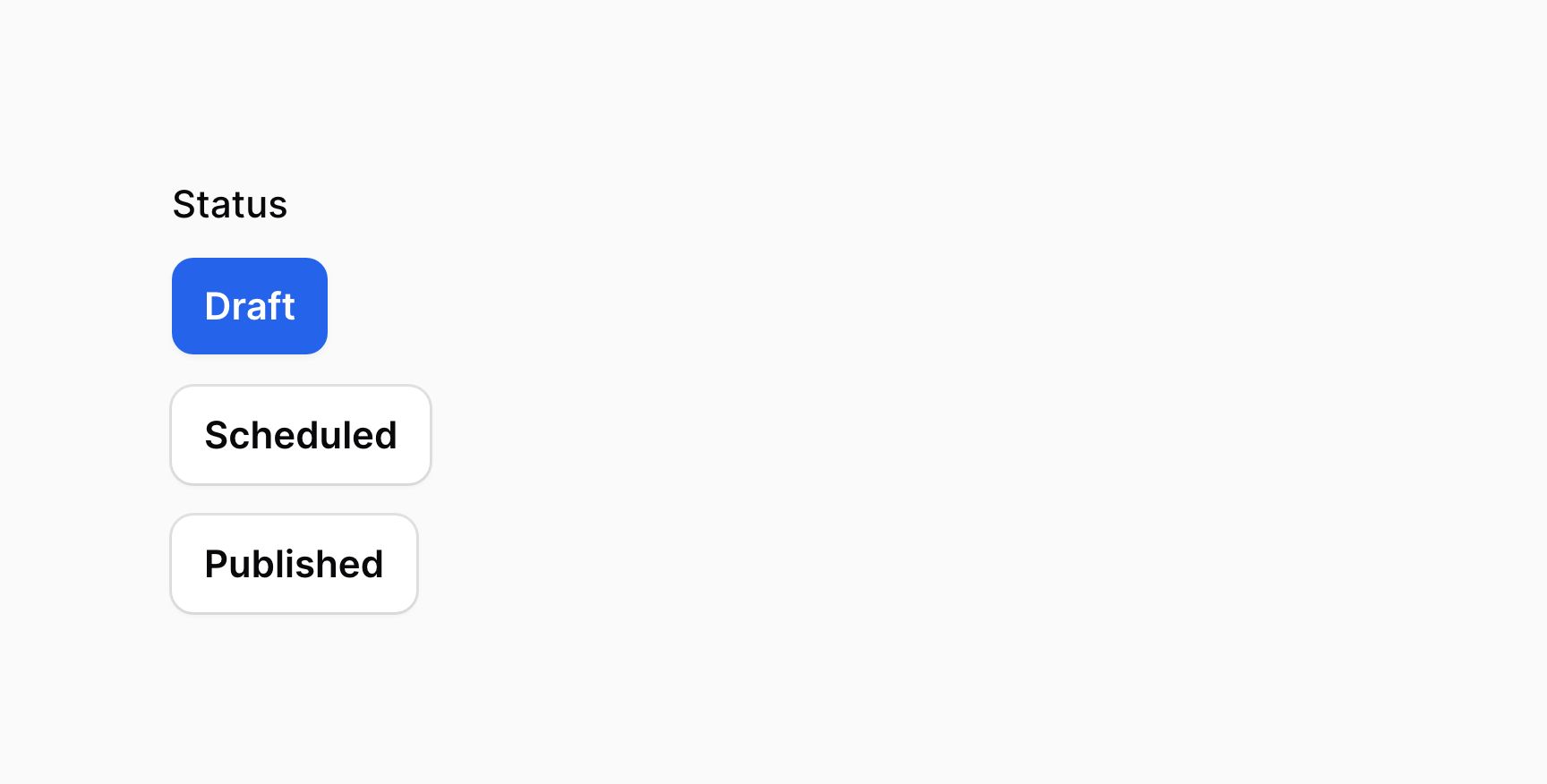
The toggle buttons input provides a group of buttons for selecting a single value, or multiple values, from a list of predefined options:
use Filament\Forms\Components\ToggleButtons; ToggleButtons::make('status') ->options([ 'draft' => 'Draft', 'scheduled' => 'Scheduled', 'published' => 'Published' ])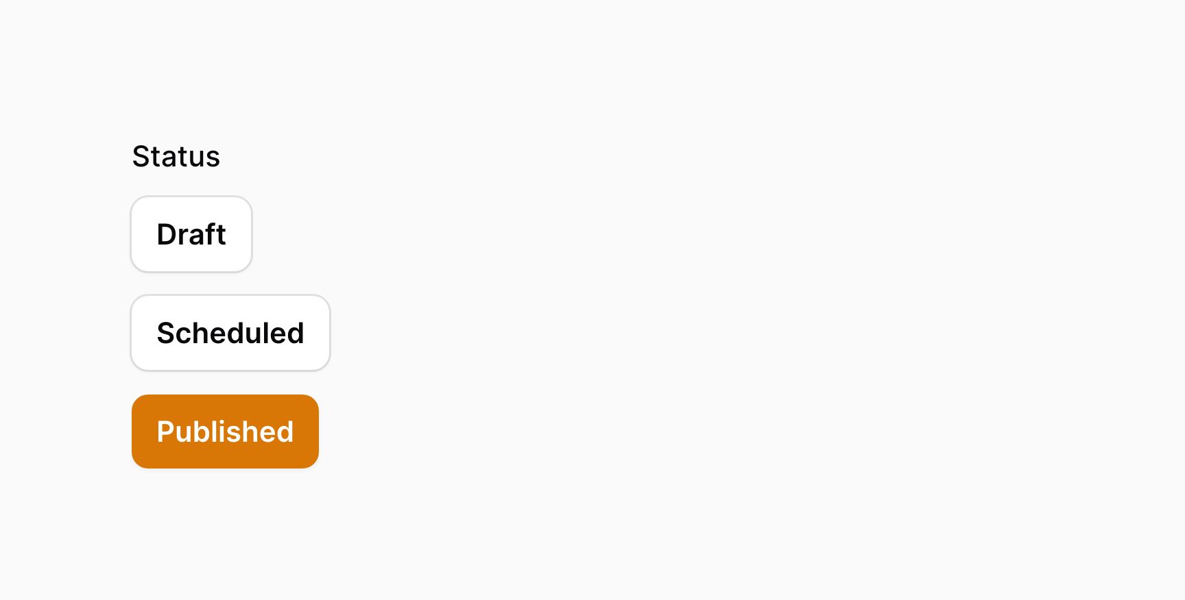
Changing the color of option buttons
You can change the color of the option buttons using the colors() method. Each key in the array should correspond to an option value, and the value may be either danger, gray, info, primary, success or warning:
use Filament\Forms\Components\ToggleButtons; ToggleButtons::make('status') ->options([ 'draft' => 'Draft', 'scheduled' => 'Scheduled', 'published' => 'Published' ]) ->colors([ 'draft' => 'info', 'scheduled' => 'warning', 'published' => 'success', ])If you are using an enum for the options, you can use the HasColor interface to define colors instead.
Adding icons to option buttons
You can add icon to the option buttons using the icons() method. Each key in the array should correspond to an option value, and the value may be any valid Blade icon:
use Filament\Forms\Components\ToggleButtons; ToggleButtons::make('status') ->options([ 'draft' => 'Draft', 'scheduled' => 'Scheduled', 'published' => 'Published' ]) ->icons([ 'draft' => 'heroicon-o-pencil', 'scheduled' => 'heroicon-o-clock', 'published' => 'heroicon-o-check-circle', ])If you are using an enum for the options, you can use the HasIcon interface to define icons instead.
If you want to display only icons, you can use hiddenButtonLabels() to hide the option labels.
Boolean options
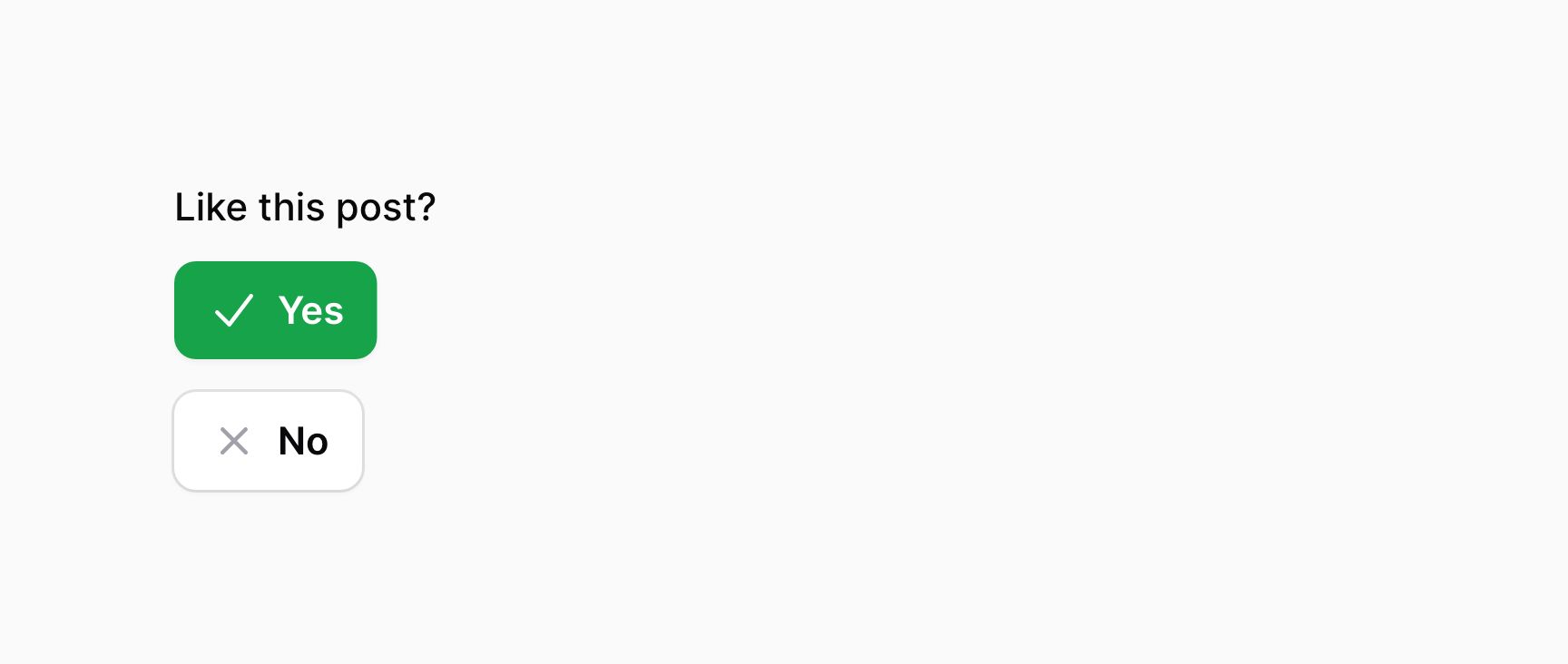
If you want a simple boolean toggle button group, with "Yes" and "No" options, you can use the boolean() method:
ToggleButtons::make('feedback') ->label('Like this post?') ->boolean()The options will have colors and icons set up automatically, but you can override these with colors() or icons().
Positioning the options inline with each other
You may wish to display the options inline() with each other:
ToggleButtons::make('feedback') ->label('Like this post?') ->boolean() ->inline()
Grouping option buttons
You may wish to group option buttons together so they are more compact, using the grouped() method. This also makes them appear horizontally inline with each other:
ToggleButtons::make('feedback') ->label('Like this post?') ->boolean() ->grouped()
Selecting multiple buttons
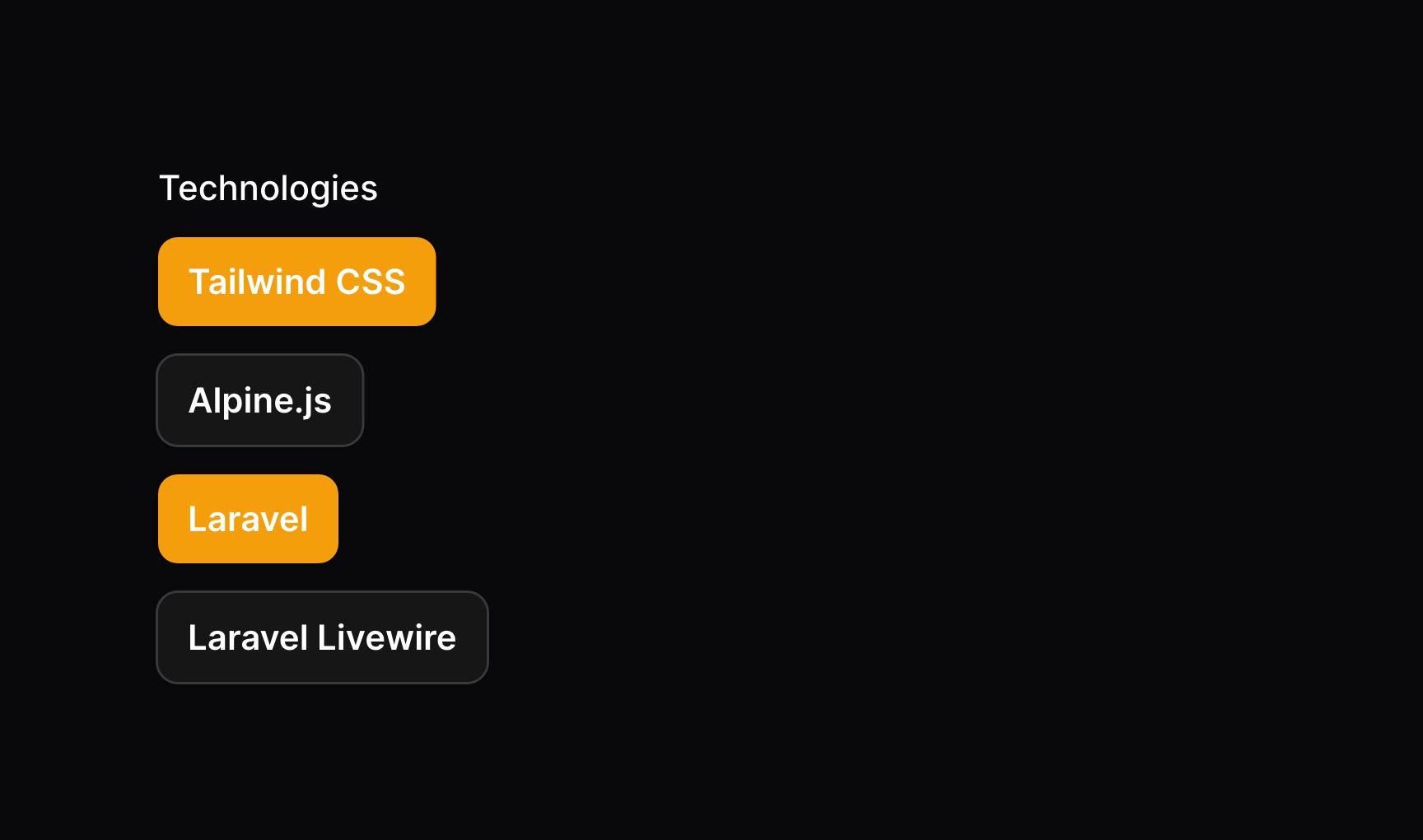
The multiple() method on the ToggleButtons component allows you to select multiple values from the list of options:
use Filament\Forms\Components\ToggleButtons; ToggleButtons::make('technologies') ->multiple() ->options([ 'tailwind' => 'Tailwind CSS', 'alpine' => 'Alpine.js', 'laravel' => 'Laravel', 'livewire' => 'Laravel Livewire', ])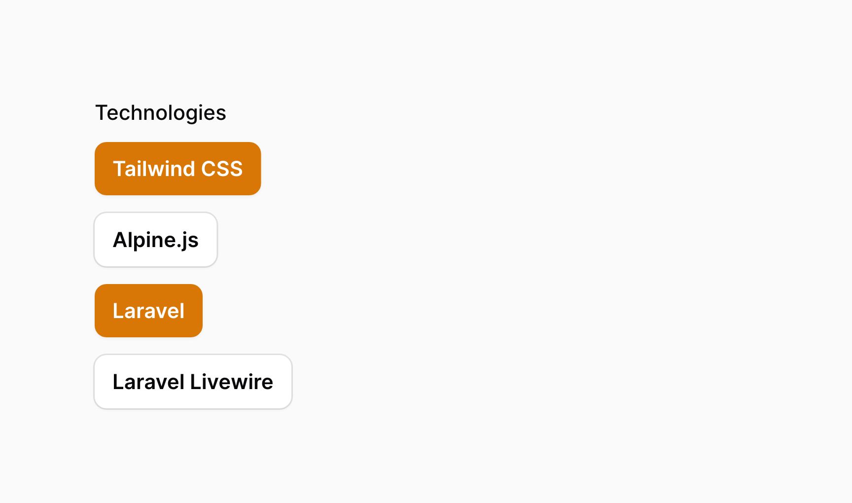
These options are returned in JSON format. If you're saving them using Eloquent, you should be sure to add an array cast to the model property:
use Illuminate\Database\Eloquent\Model; class App extends Model{ protected $casts = [ 'technologies' => 'array', ]; // ...}Splitting options into columns
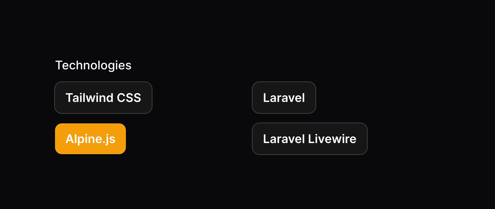
You may split options into columns by using the columns() method:
use Filament\Forms\Components\ToggleButtons; ToggleButtons::make('technologies') ->options([ // ... ]) ->columns(2)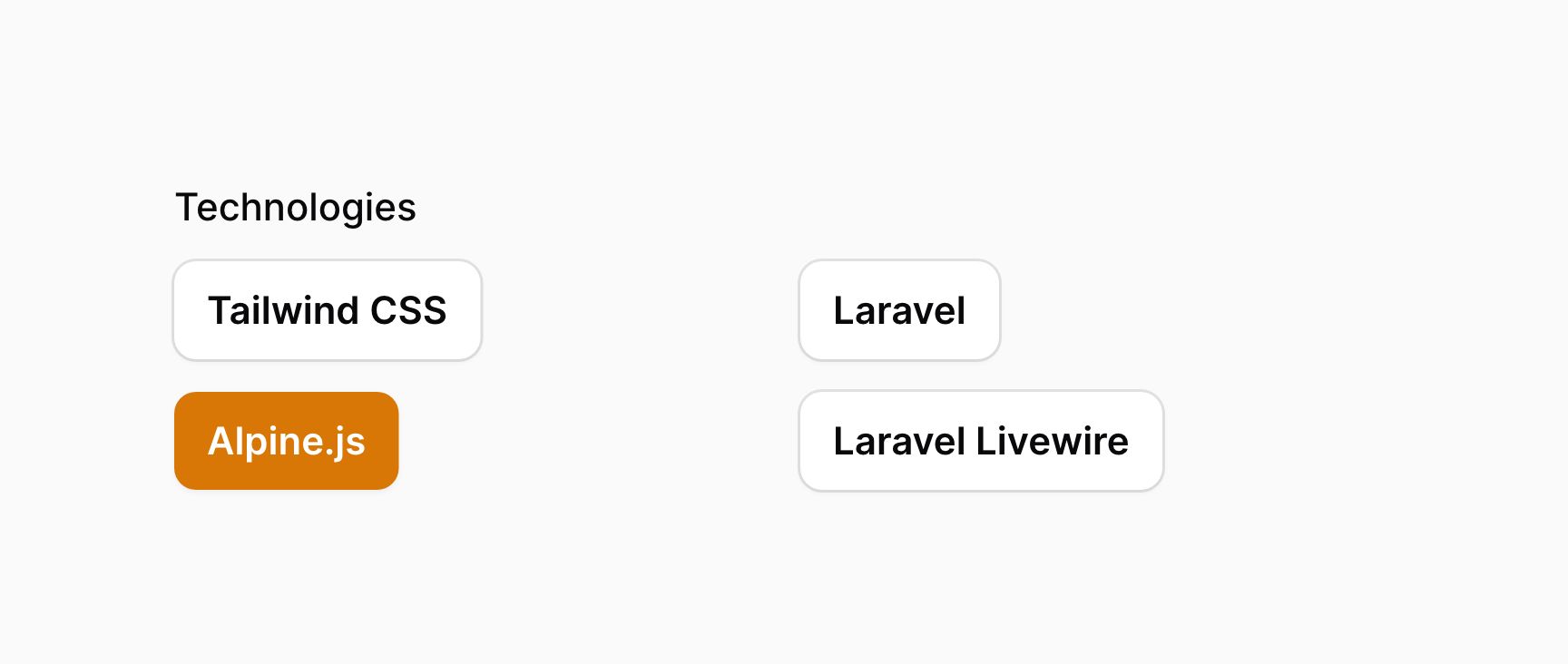
This method accepts the same options as the columns() method of the grid. This allows you to responsively customize the number of columns at various breakpoints.
Setting the grid direction
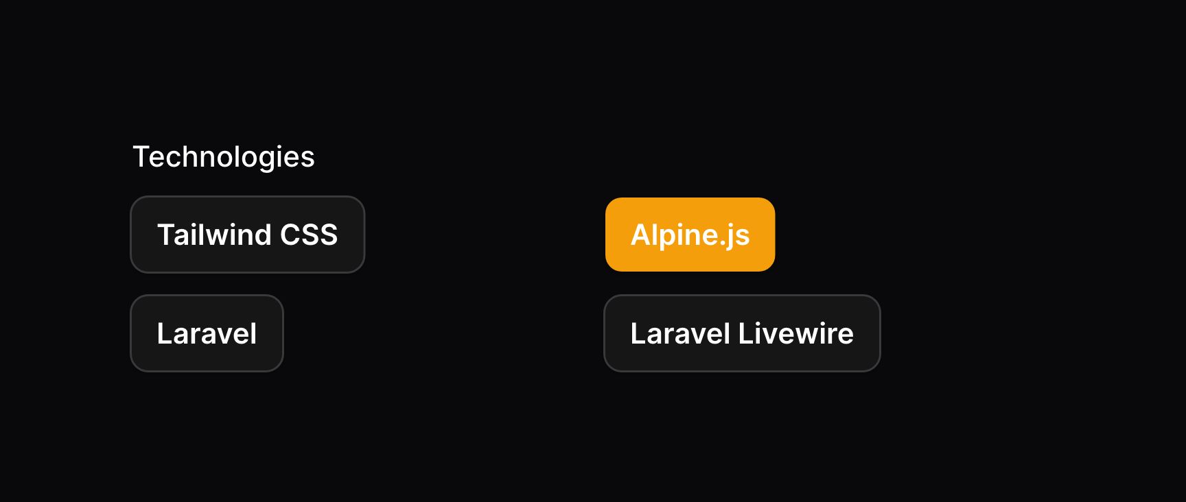
By default, when you arrange buttons into columns, they will be listed in order vertically. If you'd like to list them horizontally, you may use the gridDirection('row') method:
use Filament\Forms\Components\ToggleButtons; ToggleButtons::make('technologies') ->options([ // ... ]) ->columns(2) ->gridDirection('row')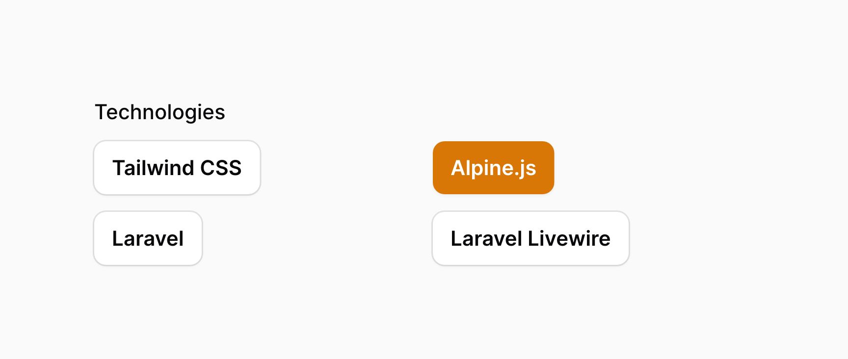
Disabling specific options
You can disable specific options using the disableOptionWhen() method. It accepts a closure, in which you can check if the option with a specific $value should be disabled:
use Filament\Forms\Components\ToggleButtons; ToggleButtons::make('status') ->options([ 'draft' => 'Draft', 'scheduled' => 'Scheduled', 'published' => 'Published', ]) ->disableOptionWhen(fn (string $value): bool => $value === 'published')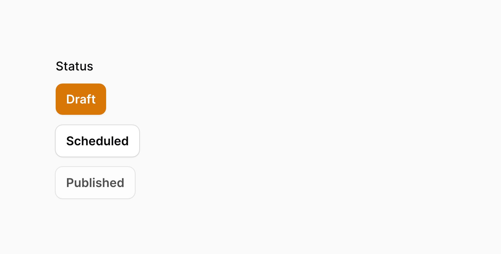
If you want to retrieve the options that have not been disabled, e.g. for validation purposes, you can do so using getEnabledOptions():
use Filament\Forms\Components\ToggleButtons; ToggleButtons::make('status') ->options([ 'draft' => 'Draft', 'scheduled' => 'Scheduled', 'published' => 'Published', ]) ->disableOptionWhen(fn (string $value): bool => $value === 'published') ->in(fn (ToggleButtons $component): array => array_keys($component->getEnabledOptions()))Still need help? Join our Discord community or open a GitHub discussion
