
Widgets
Chart widgets
Introduction
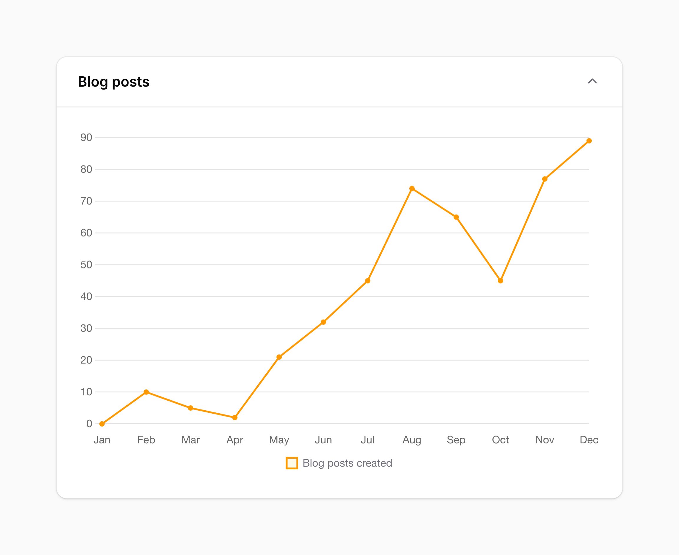
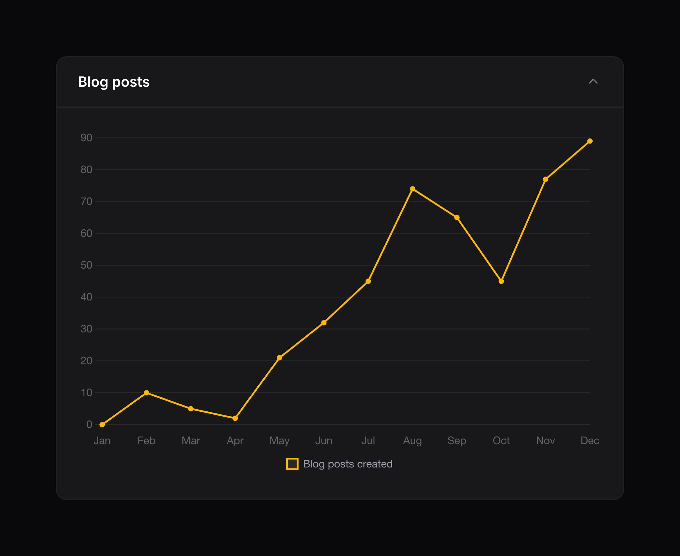
Filament comes with many “chart” widget templates, which you can use to display real-time, interactive charts.
Start by creating a widget with the command:
php artisan make:filament-widget BlogPostsChart --chart
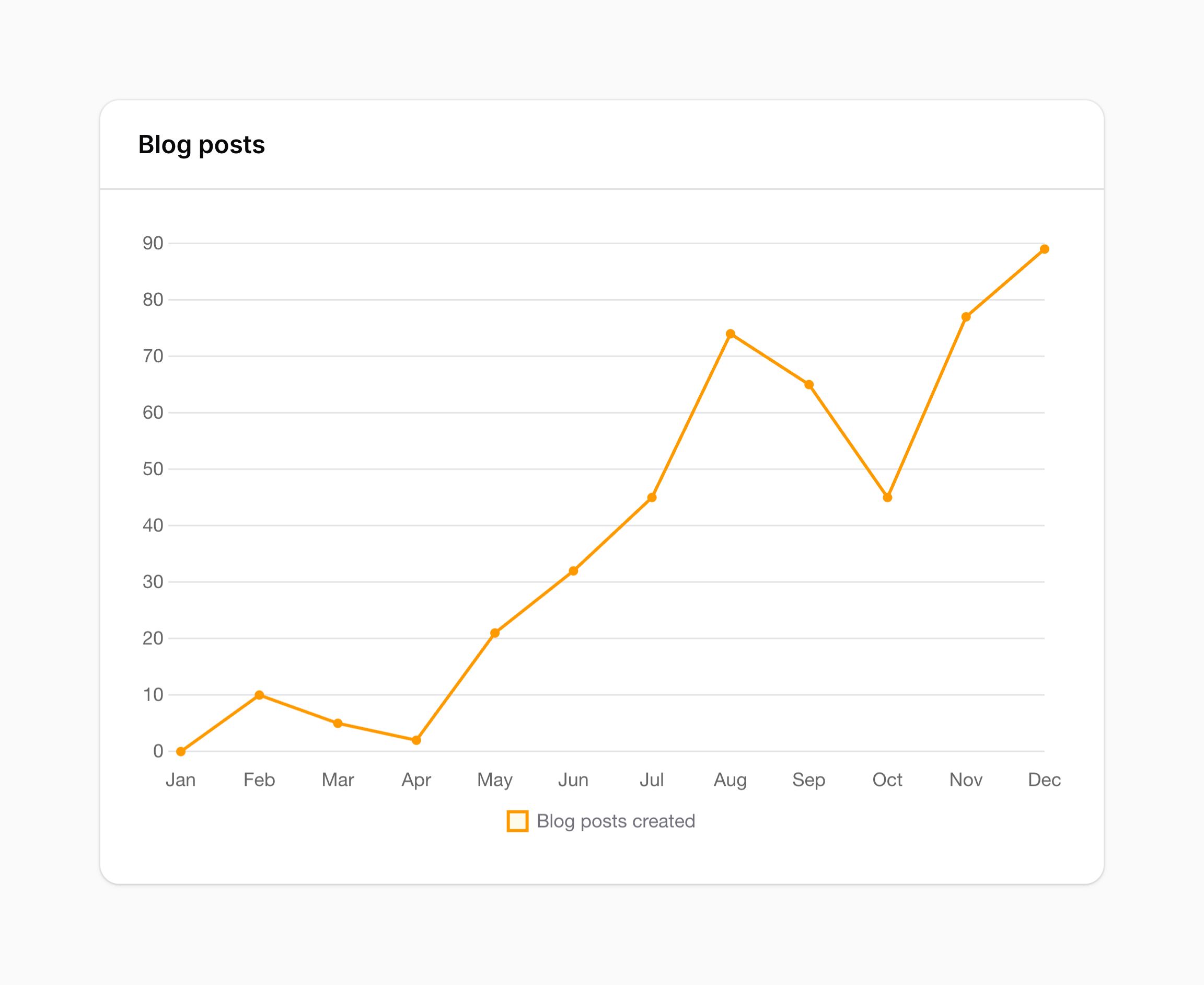
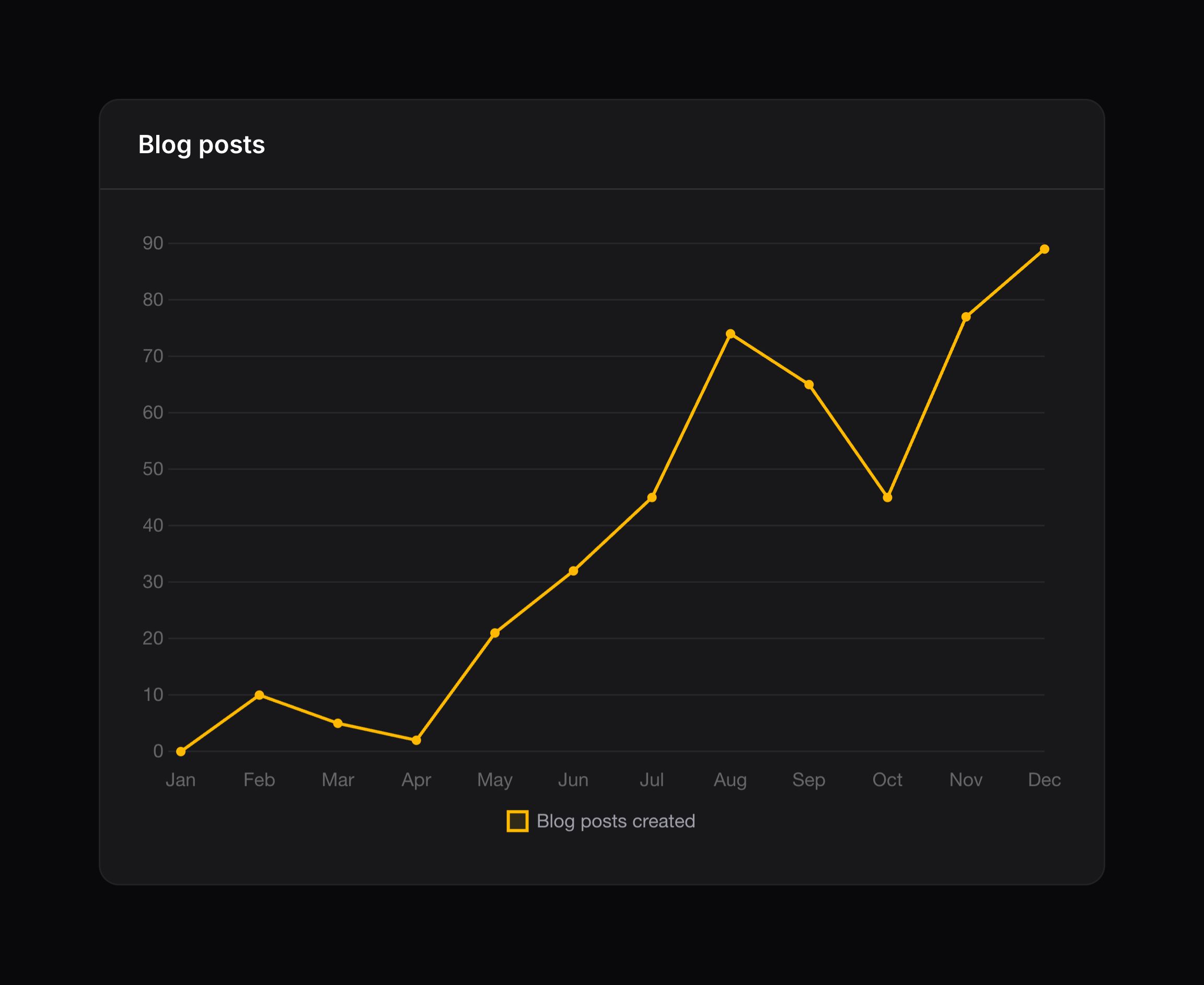
There is a single ChartWidget class that is used for all charts. The type of chart is set by the getType() method. In this example, that method returns the string 'line'.
The protected ?string $heading variable is used to set the heading that describes the chart. If you need to set the heading dynamically, you can override the getHeading() method.
The getData() method is used to return an array of datasets and labels. Each dataset is a labeled array of points to plot on the chart, and each label is a string. This structure is identical to the Chart.js library, which Filament uses to render charts. You may use the Chart.js documentation to fully understand the possibilities to return from getData(), based on the chart type.
<?php

namespace App\Filament\Widgets;

use Filament\Widgets\ChartWidget;

class BlogPostsChart extends ChartWidget
{
    protected ?string $heading = 'Blog Posts';

    protected function getData(): array
    {
        return [
            'datasets' => [
                [
                    'label' => 'Blog posts created',
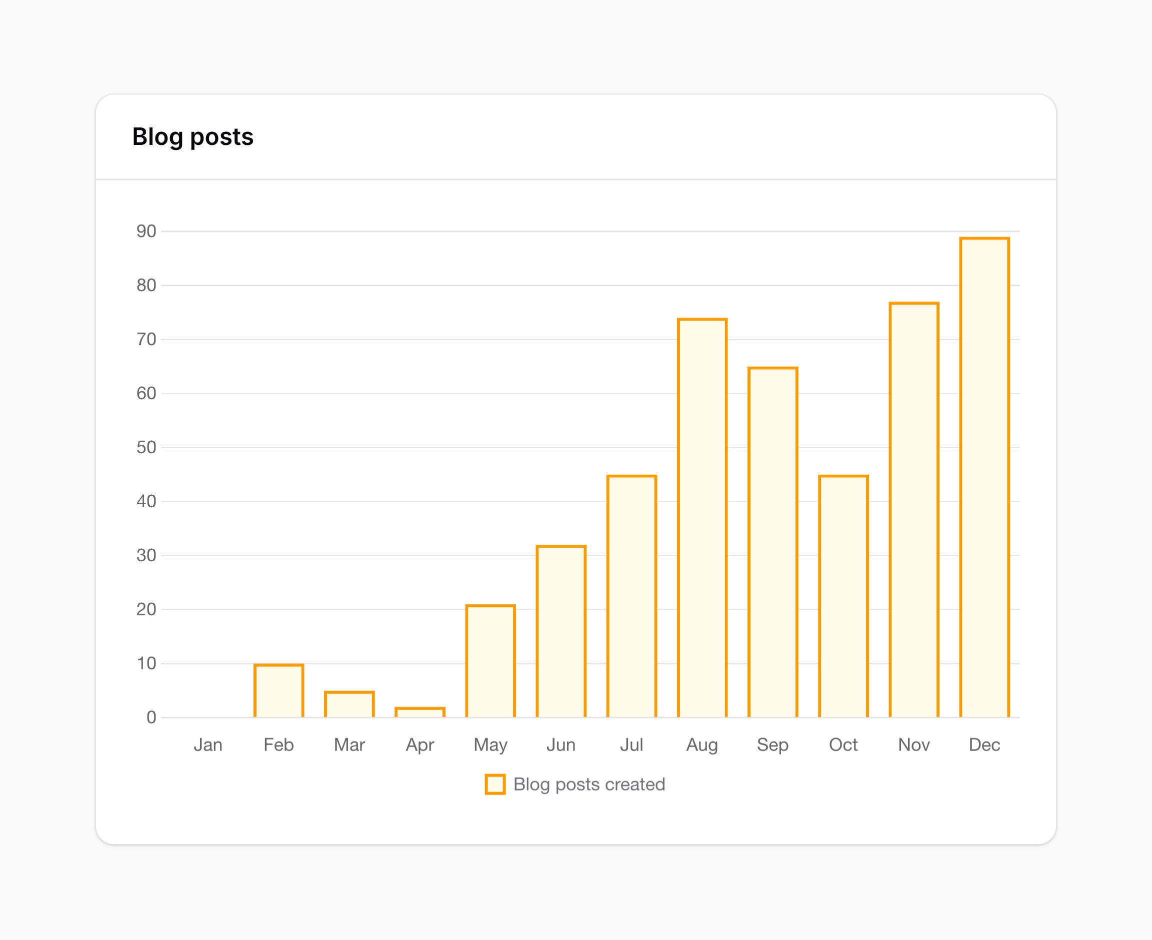
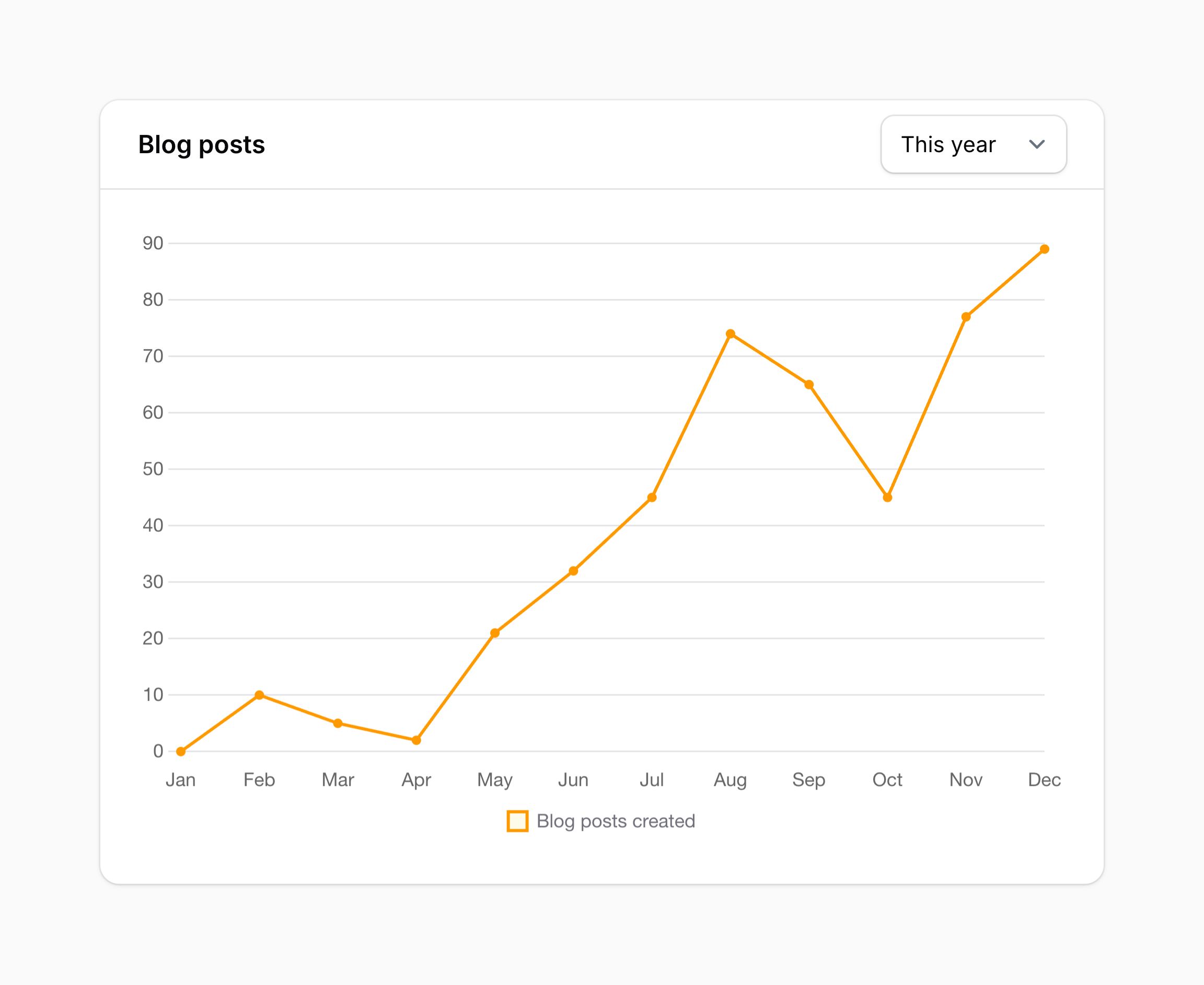
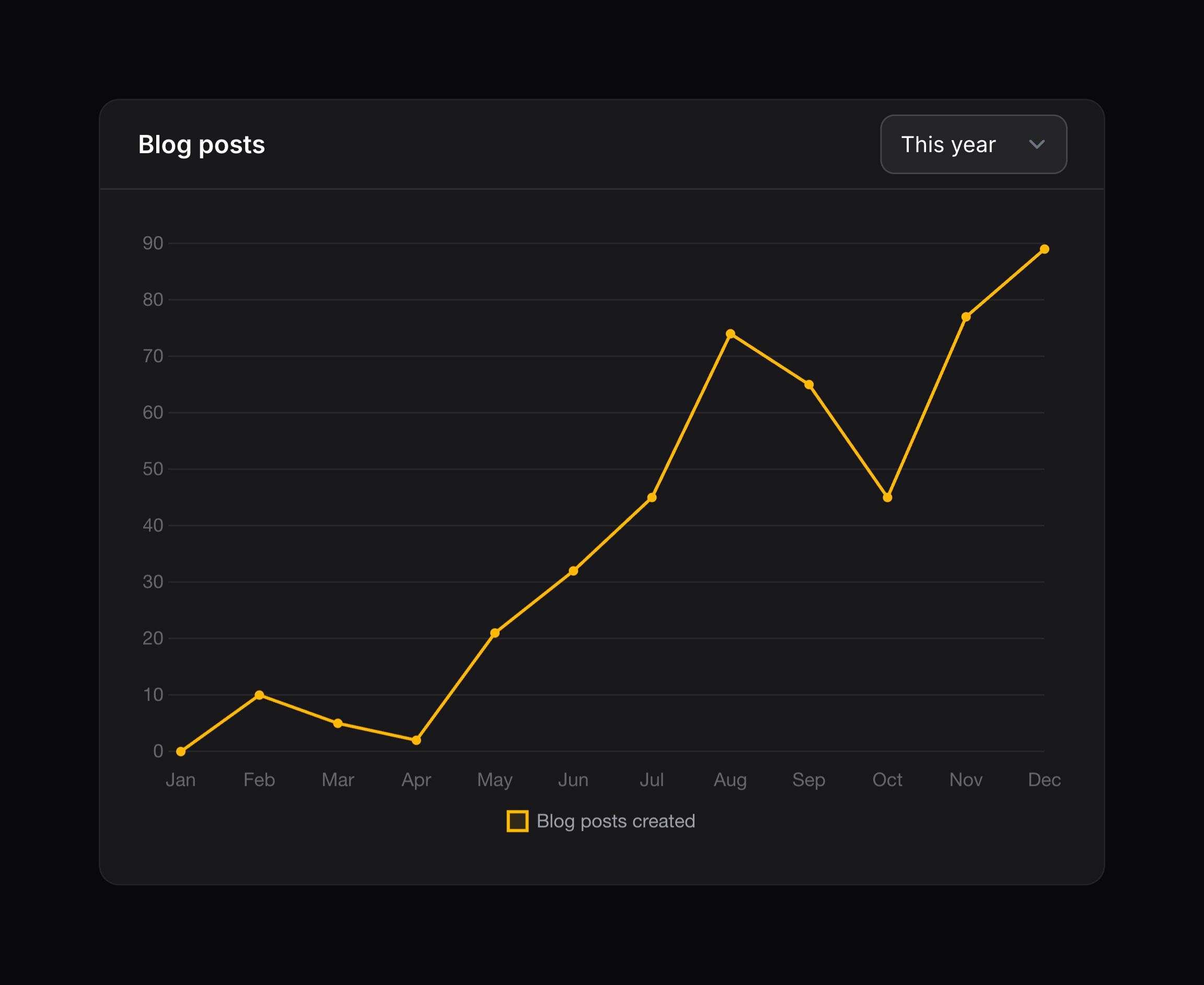
                    'data' => [0, 10, 5, 2, 21, 32, 45, 74, 65, 45, 77, 89],
                ],
            ],
            'labels' => ['Jan', 'Feb', 'Mar', 'Apr', 'May', 'Jun', 'Jul', 'Aug', 'Sep', 'Oct', 'Nov', 'Dec'],
        ];
    }

    protected function getType(): string
    {
        return 'line';
    }
}
Now, check out your widget in the dashboard.
Available chart types
Below is a list of available chart widget classes which you may extend, and their corresponding Chart.js documentation page, for inspiration on what to return from getData():
- Bar chart - Chart.js documentation
- Bubble chart - Chart.js documentation
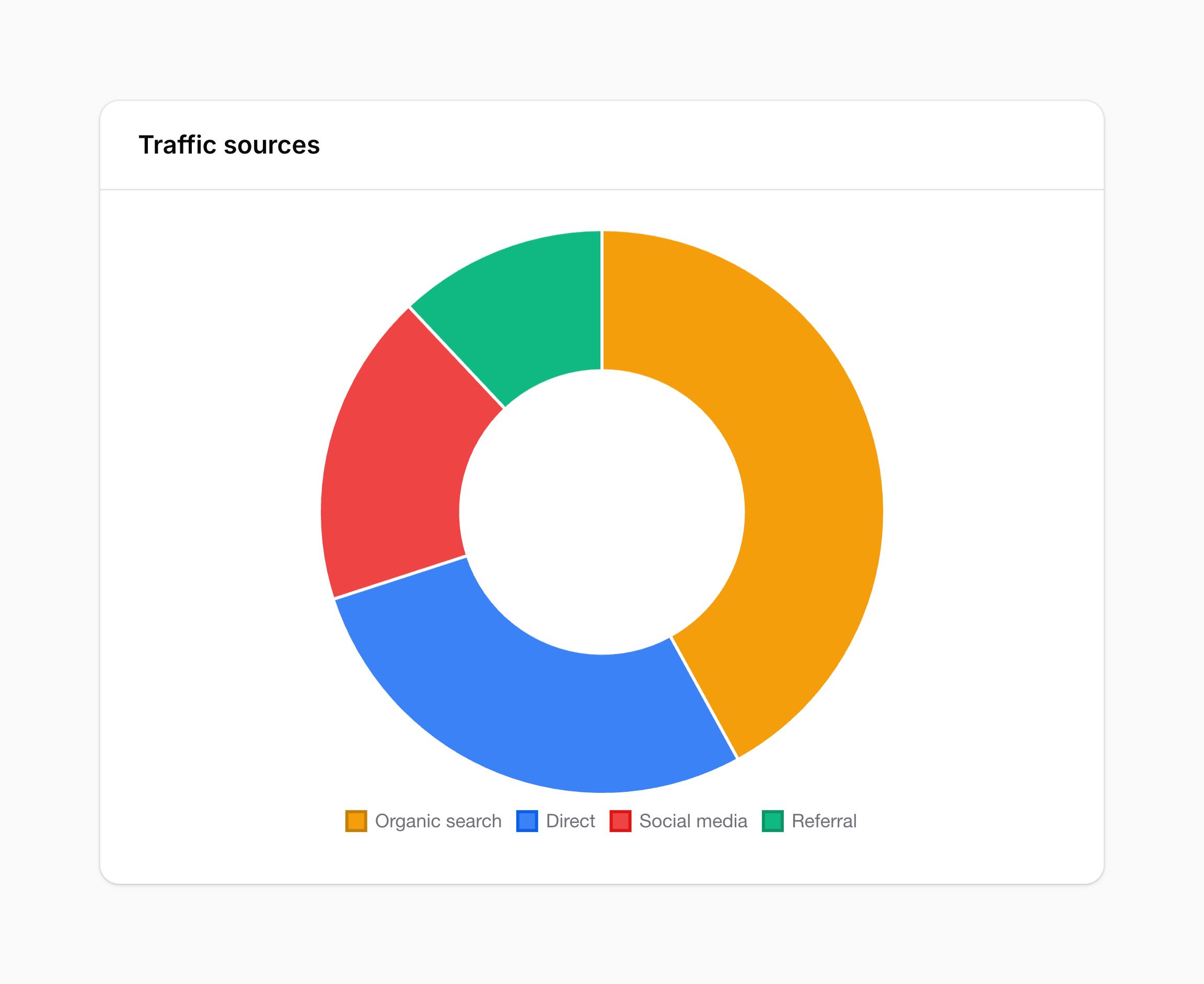
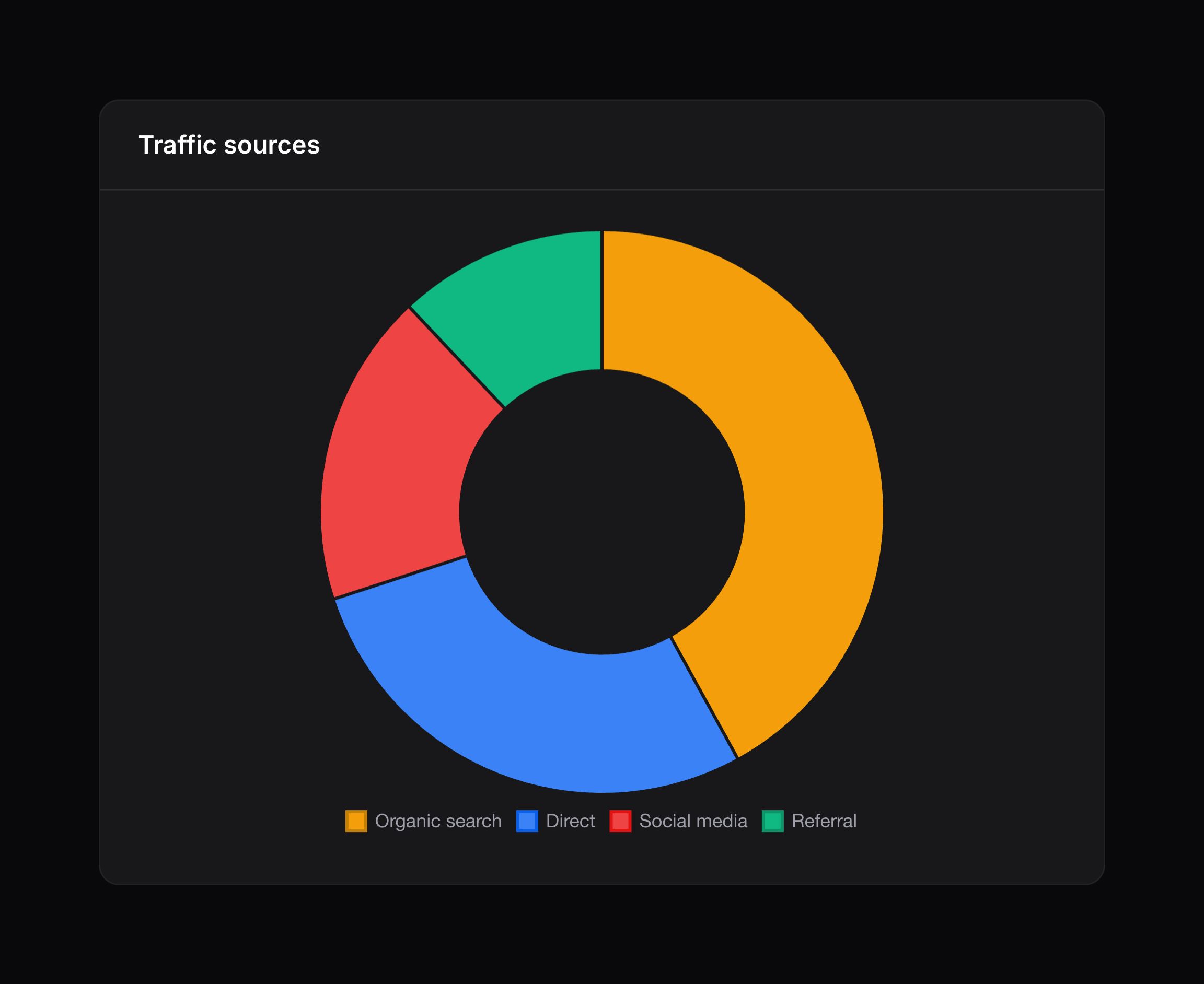
- Doughnut chart - Chart.js documentation
- Line chart - Chart.js documentation
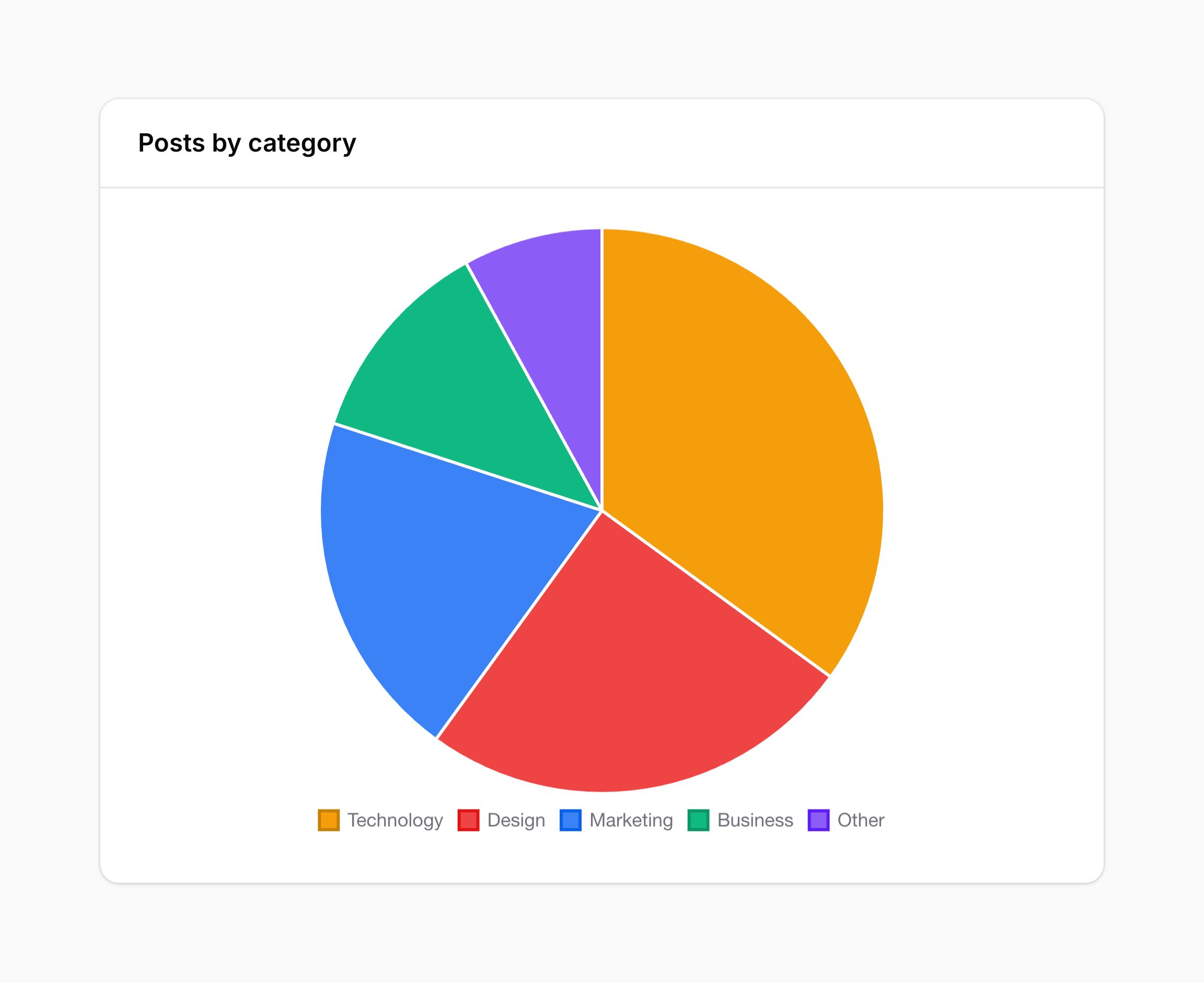
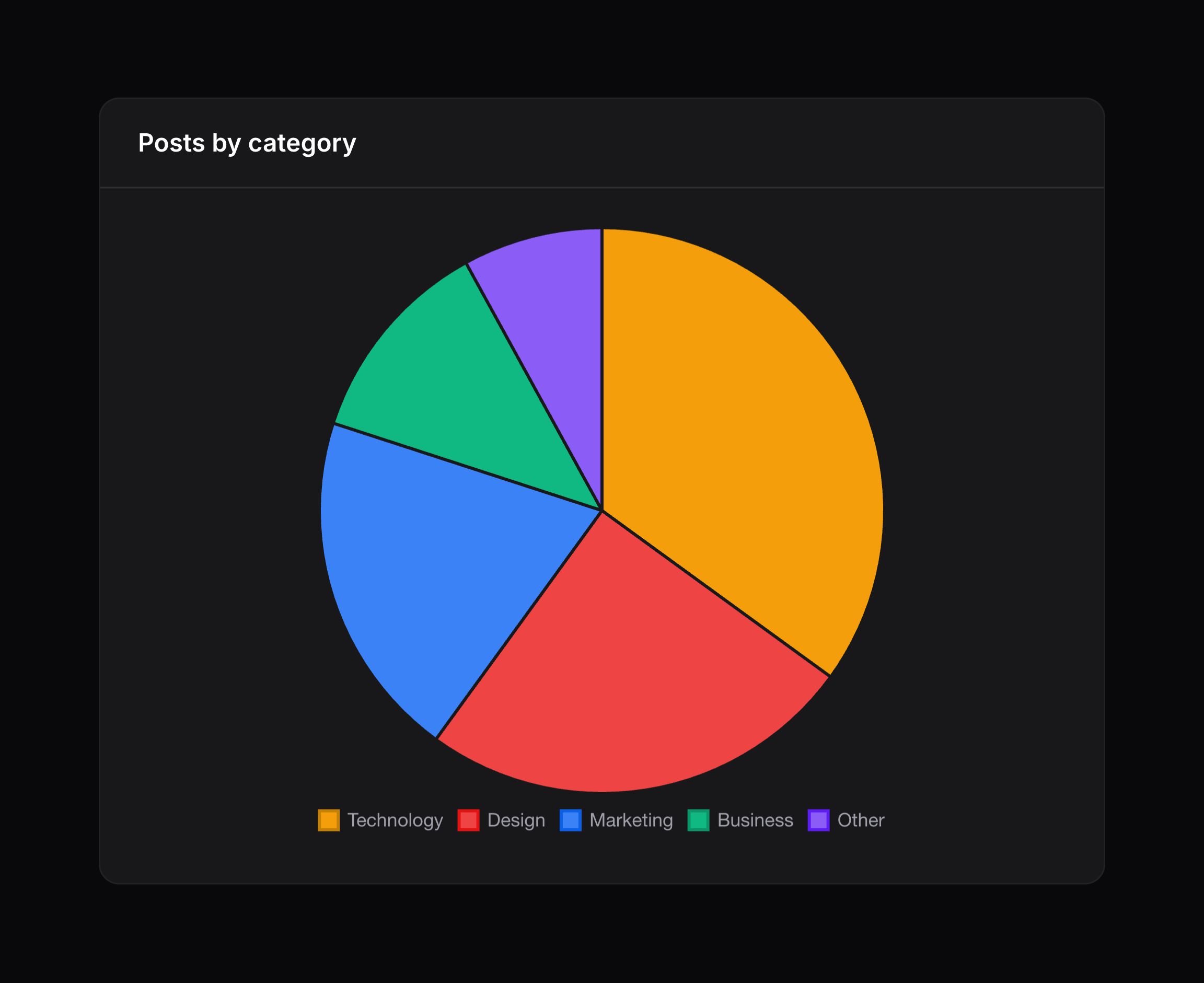
- Pie chart - Chart.js documentation
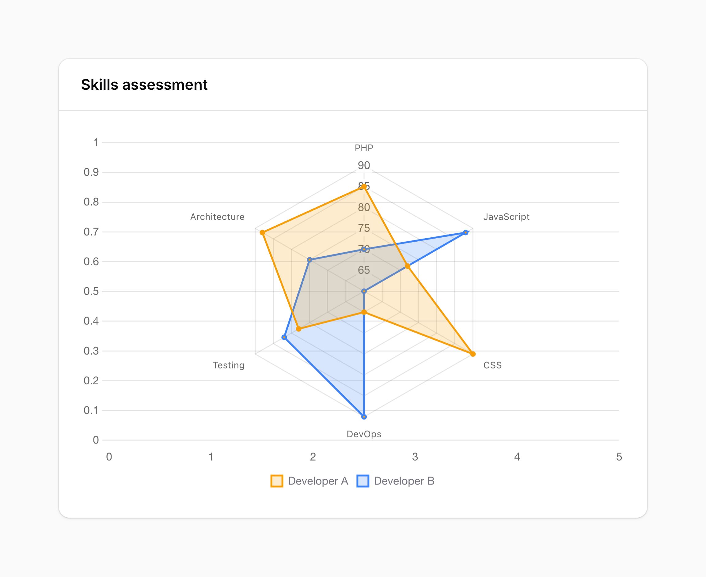
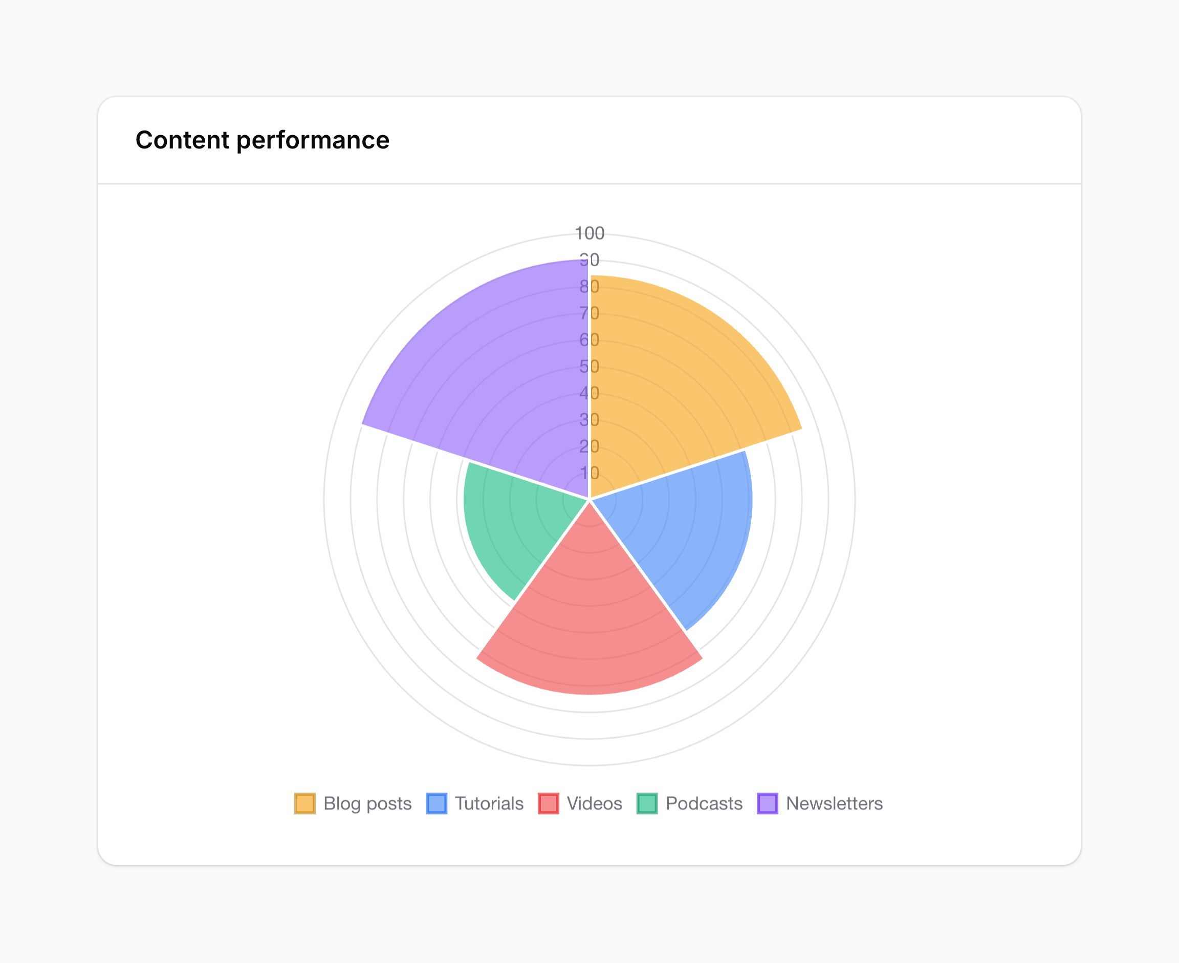
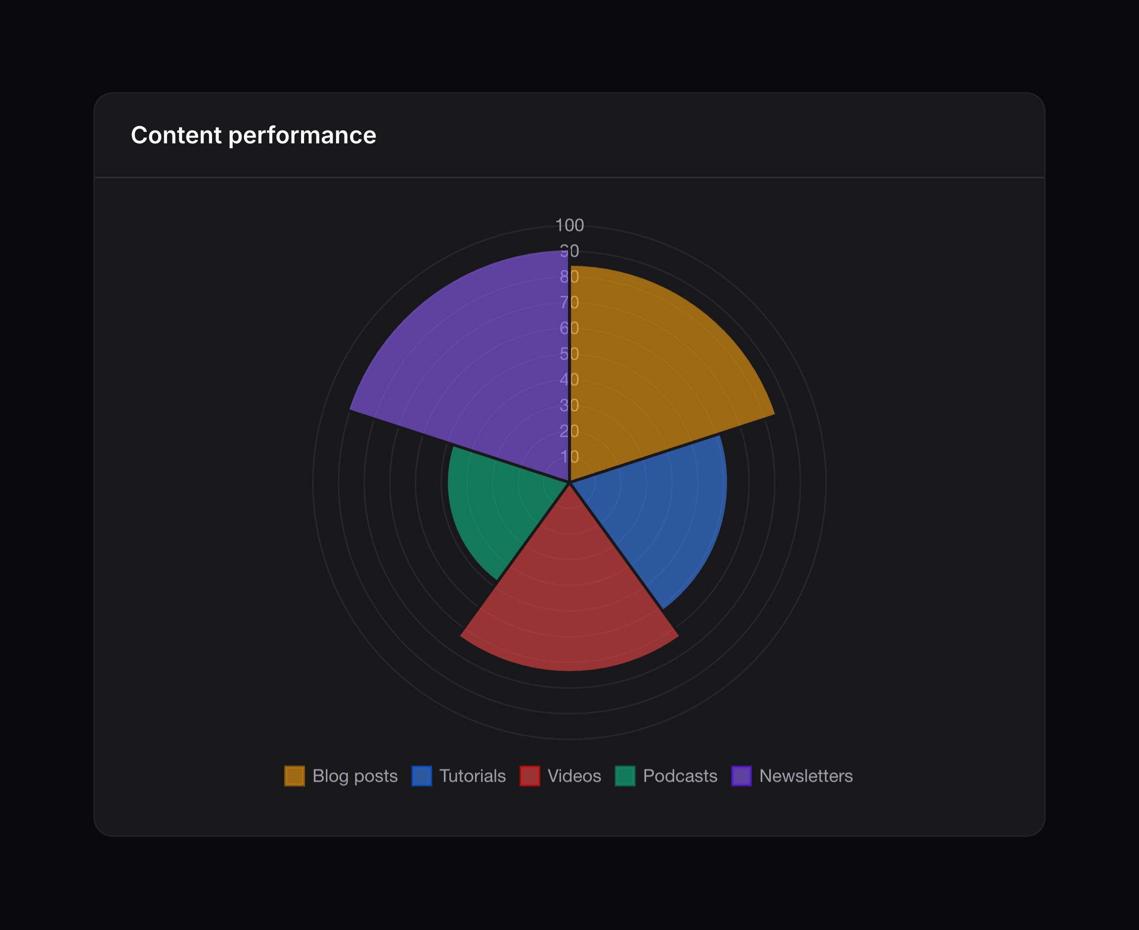
- Polar area chart - Chart.js documentation
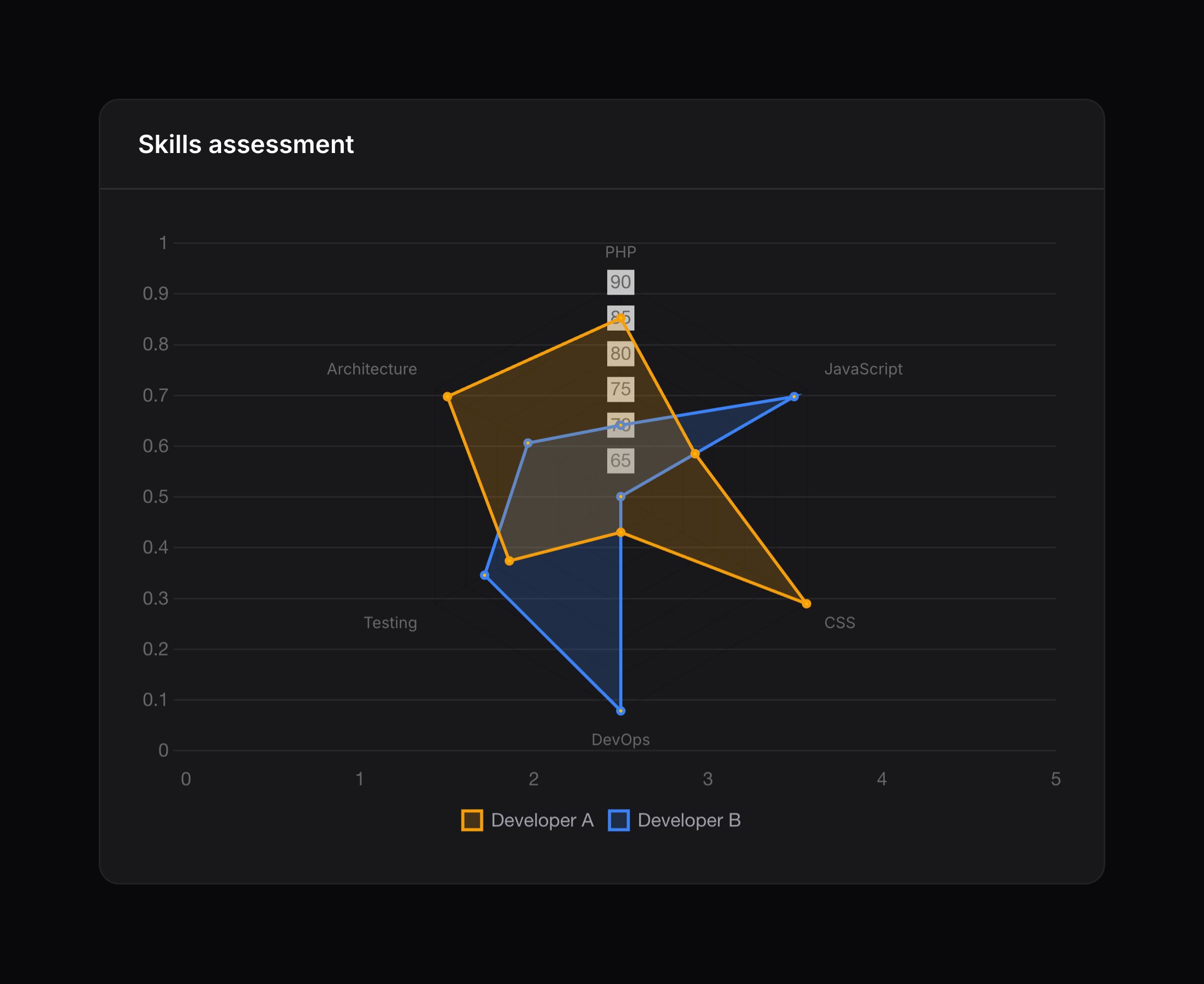
- Radar chart - Chart.js documentation
- Scatter chart - Chart.js documentation
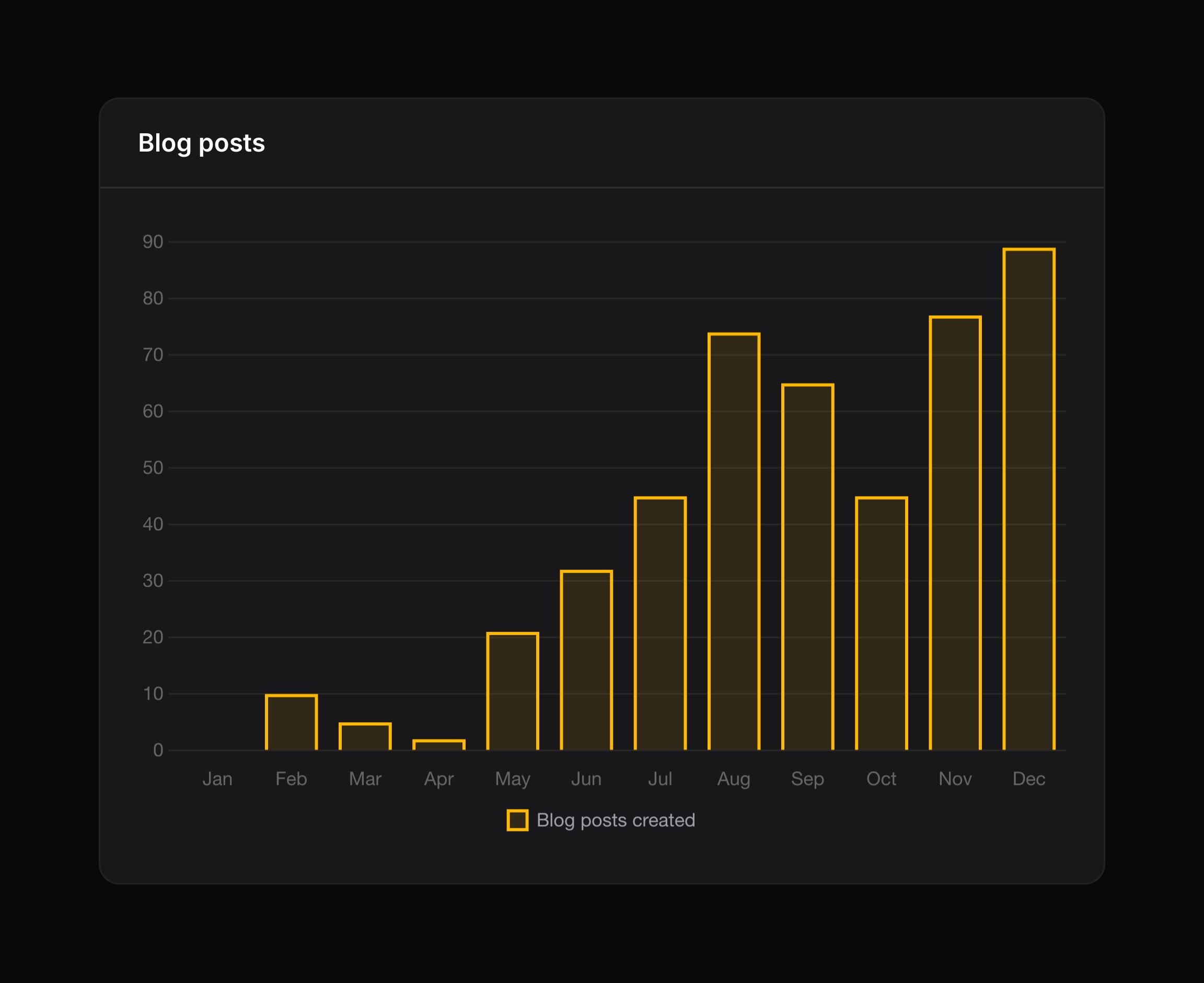
For example, you could use a bar chart by returning 'bar' from the getType() method:
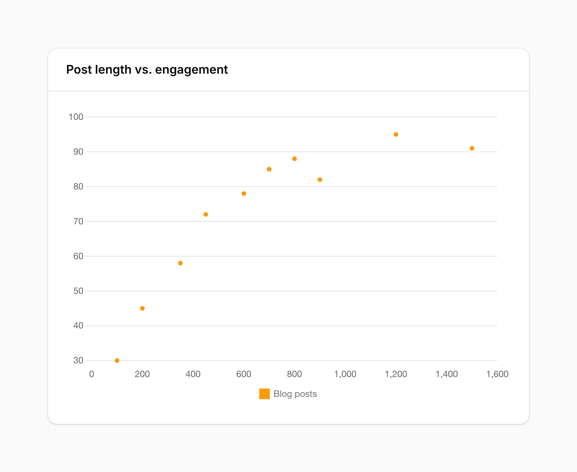
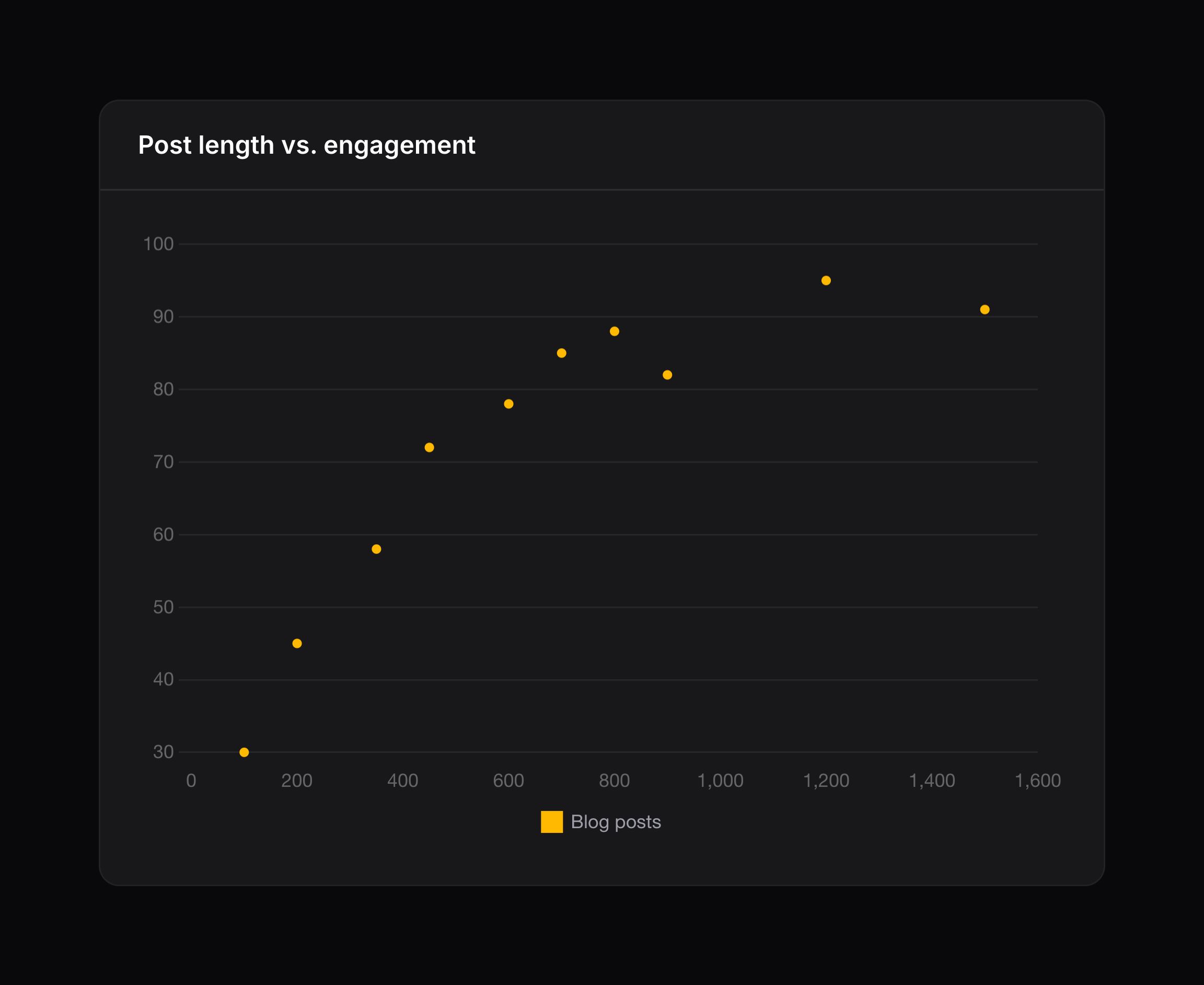
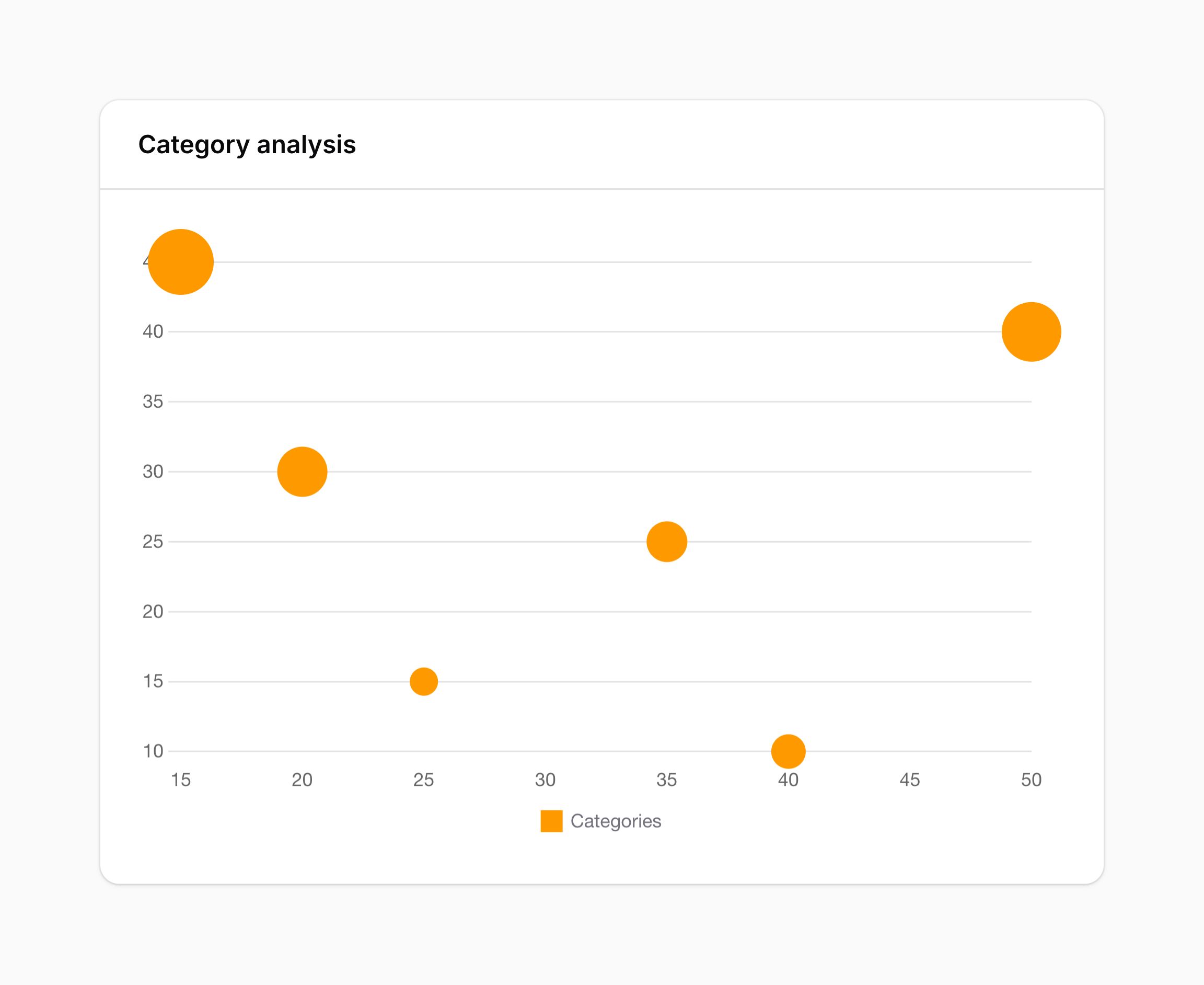
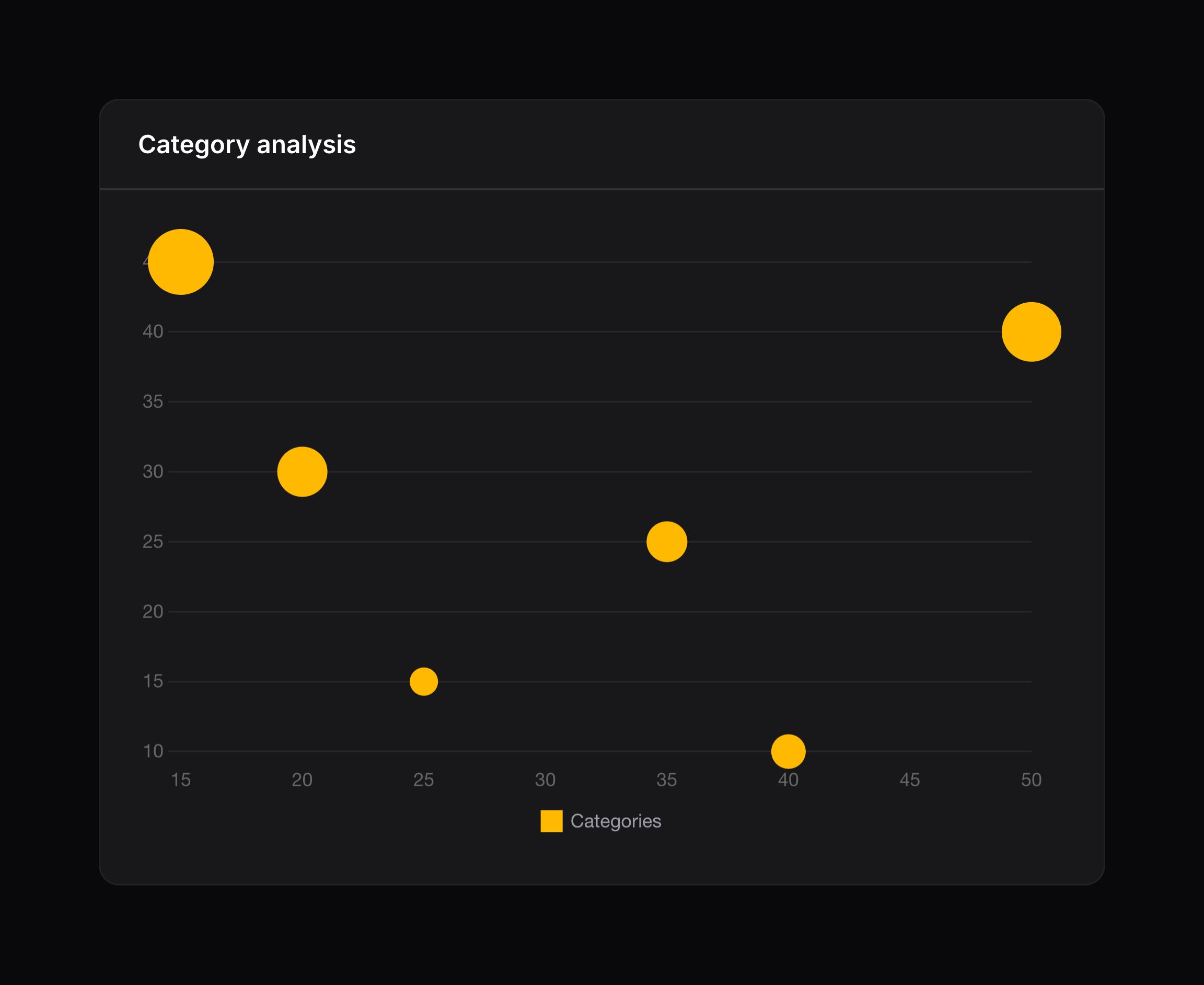
Here are examples of the other available chart types:
Customizing the chart color
You can customize the color of the chart data by setting the $color property:
protected string $color = 'info';
If you’re looking to customize the color further, or use multiple colors across multiple datasets, you can still make use of Chart.js’s color options in the data:
protected function getData(): array
{
    return [
        'datasets' => [
            [
                'label' => 'Blog posts created',
                'data' => [0, 10, 5, 2, 21, 32, 45, 74, 65, 45, 77, 89],
                'backgroundColor' => '#36A2EB',
                'borderColor' => '#9BD0F5',
            ],
        ],
        'labels' => ['Jan', 'Feb', 'Mar', 'Apr', 'May', 'Jun', 'Jul', 'Aug', 'Sep', 'Oct', 'Nov', 'Dec'],
    ];
}
Generating chart data from an Eloquent model
To generate chart data from an Eloquent model, Filament recommends that you install the flowframe/laravel-trend package. You can view the documentation.
Here is an example of generating chart data from a model using the laravel-trend package:
use Flowframe\Trend\Trend;
use Flowframe\Trend\TrendValue;

protected function getData(): array
{
    $data = Trend::model(BlogPost::class)
        ->between(
            start: now()->startOfYear(),
            end: now()->endOfYear(),
        )
        ->perMonth()
        ->count();

    return [
        'datasets' => [
            [
                'label' => 'Blog posts',
                'data' => $data->map(fn (TrendValue $value) => $value->aggregate),
            ],
        ],
        'labels' => $data->map(fn (TrendValue $value) => $value->date),
    ];
}
Filtering chart data
Basic Select filter
You can set up chart filters to change the data that is presented. Commonly, this is used to change the time period that chart data is rendered for.
To set a default filter value, set the $filter property:
public ?string $filter = 'today';
Then, define the getFilters() method to return an array of values and labels for your filter:
protected function getFilters(): ?array
{
    return [
        'today' => 'Today',
        'week' => 'Last week',
        'month' => 'Last month',
        'year' => 'This year',
    ];
}
You can use the active filter value within your getData() method:
protected function getData(): array
{
    $activeFilter = $this->filter;

    // ...
}
NOTE
The $filter property is user-controllable. Although the <select> element only offers the keys returned from getFilters(), a crafted request can set $this->filter to any string, so it is not limited to those keys. You must ensure the value is valid before using it in a query — for example, by checking it against the keys of getFilters(), or by using a match expression with a safe default. Never interpolate $this->filter directly into a raw query.
Custom filters
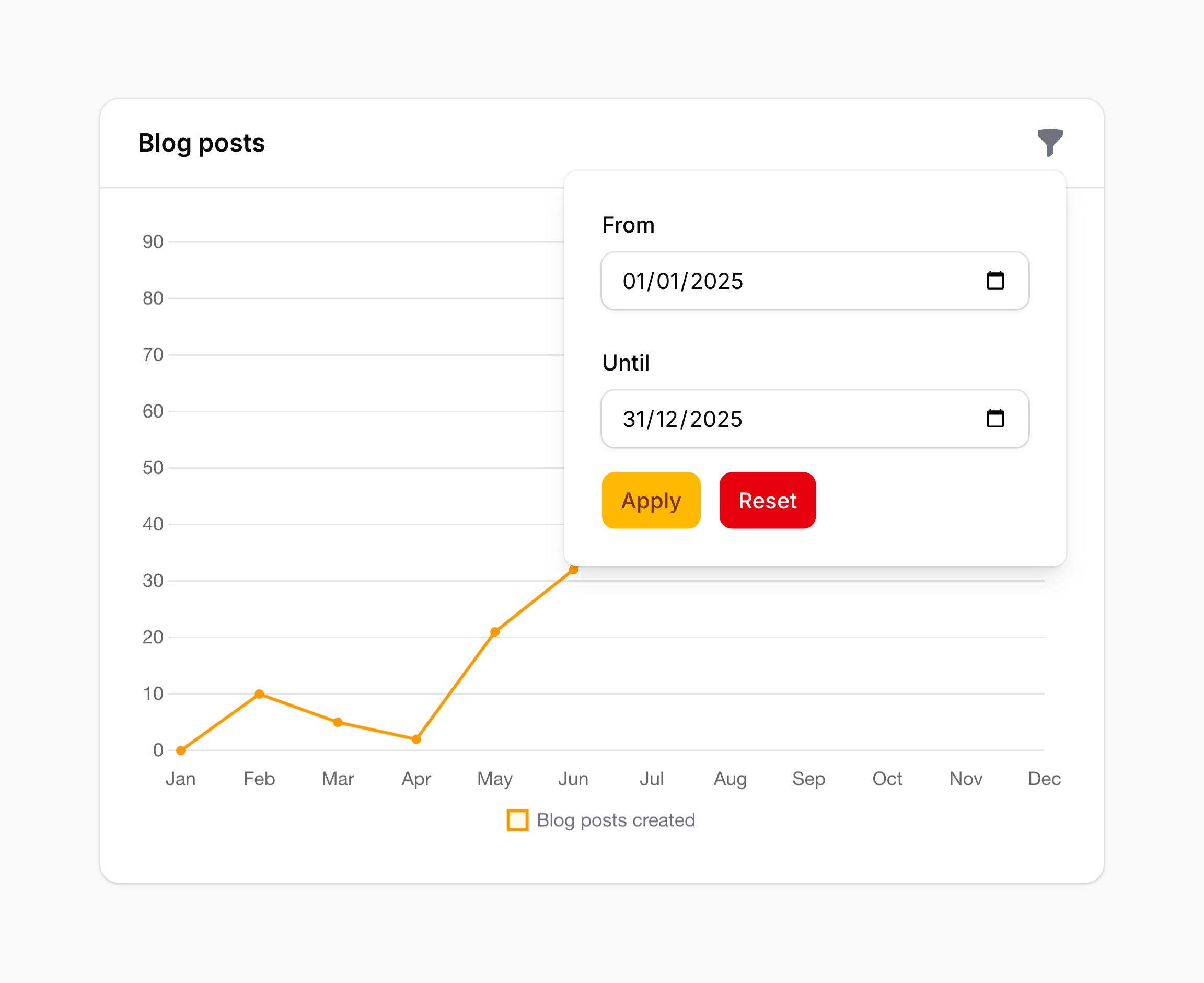
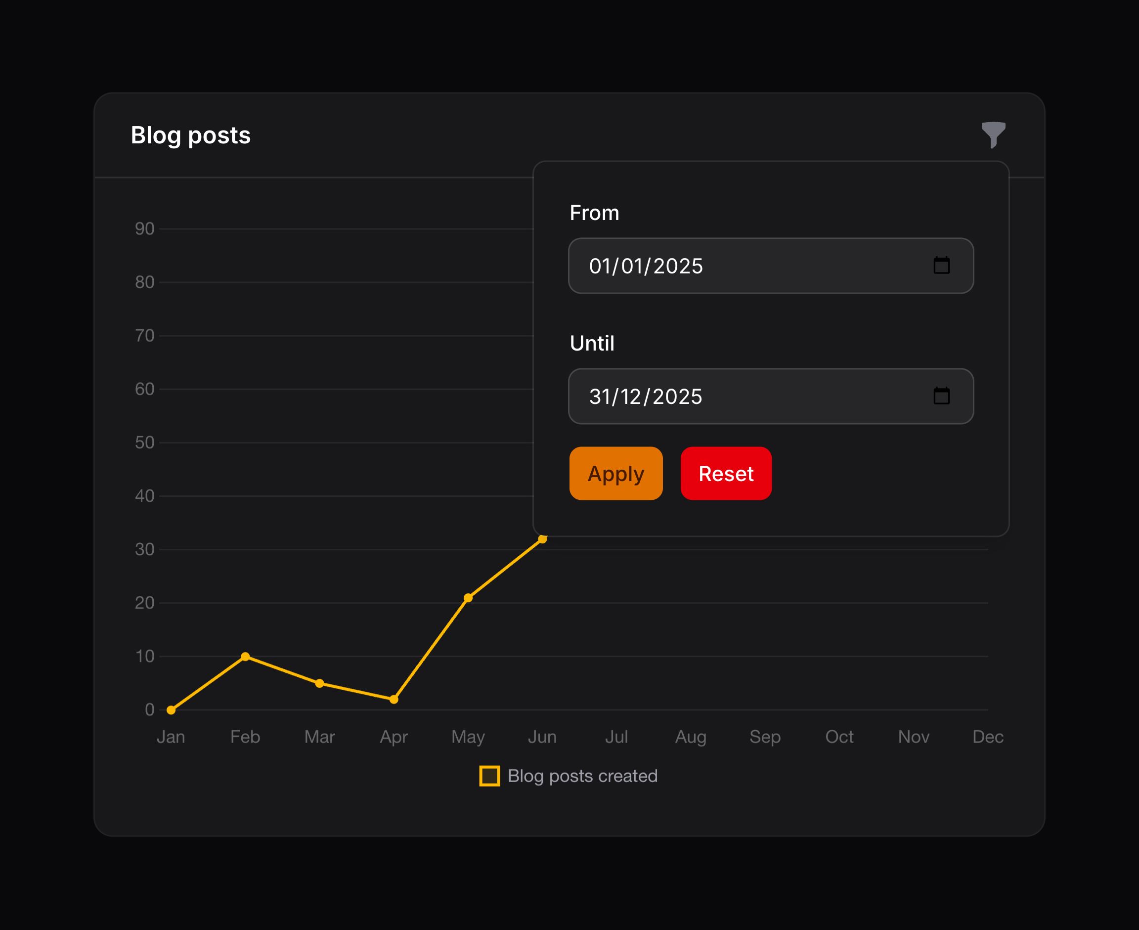
You can use schema components to build custom filters for your chart widget. This approach offers a more flexible way to define filters.
To get started, use the HasFiltersSchema trait and implement the filtersSchema() method:
use Filament\Forms\Components\DatePicker;
use Filament\Schemas\Schema;
use Filament\Widgets\ChartWidget\Concerns\HasFiltersSchema;

class BlogPostsChart extends ChartWidget
{
    use HasFiltersSchema;

    // ...

    public function filtersSchema(Schema $schema): Schema
    {
        return $schema->components([
            DatePicker::make('startDate')
                ->default(now()->subDays(30)),
            DatePicker::make('endDate')
                ->default(now()),
        ]);
    }
}
The filter values are accessible via the $this->filters array. You can use these values inside your getData() method:
protected function getData(): array
{
    $startDate = $this->filters['startDate'] ?? null;
    $endDate = $this->filters['endDate'] ?? null;

    return [
        // ...
    ];
}
The $this->filters array will always reflect the current form data. Please note that this data is not validated, as it is available live and not intended to be used for anything other than querying the database. You must ensure that the data is valid before using it.
NOTE
If you want to add filters that apply to multiple widgets at once, see filtering widget data in the dashboard.
Deferring filter updates
By default, filters using the filtersSchema() method update the chart data immediately as they are changed. However, for complex queries or better user experience, you may want to defer filter updates until the user clicks an “Apply” button.
When deferred, filter changes are only applied when the user clicks the “Apply” button. This ensures that the chart only re-renders when the user has finished adjusting all of their filters.
The chart will display data using the default filter values when the page first loads, ensuring users see meaningful data immediately without needing to take action.
To enable deferred filters, set the $hasDeferredFilters property to true:
use Filament\Widgets\ChartWidget\Concerns\HasFiltersSchema;

class BlogPostsChart extends ChartWidget
{
    use HasFiltersSchema;

    protected bool $hasDeferredFilters = true;

    // ...
}
If you need dynamic control over whether filters are deferred, you may override the hasDeferredFilters() method:
public function hasDeferredFilters(): bool
{
    return auth()->user()->prefersDeferredFilters();
}
Resetting filters to defaults
When using deferred filters, a “Reset” link appears in the filter dropdown footer alongside the “Apply” button. Clicking this link restores all filters to their default values as defined in the filtersSchema() method. For example, if you set ->default(now()->subDays(30)) on a DatePicker, the reset action will restore that default date, not an empty value.
Customizing filter actions
You may customize the apply and reset actions that appear when using deferred filters. All methods that are available to customize action trigger buttons can be used:
use Filament\Actions\Action;

public function filtersApplyAction(Action $action): Action
{
    return $action
        ->label('Update Chart')
        ->color('success');
}

public function filtersResetAction(Action $action): Action
{
    return $action
        ->label('Clear Filters')
        ->color('danger');
}
Empty state
When the getData() method returns an empty array, the chart widget renders an “empty state” instead of the chart.
To customize when the empty state is rendered, override the isEmpty() method:
public function isEmpty(): bool
{
    $data = $this->getCachedData();

    return empty($data['datasets'][0]['data'] ?? []);
}
Setting the empty state heading
To customize the heading of the empty state, set the $emptyStateHeading property:
protected ?string $emptyStateHeading = 'No data available';
Alternatively, you can override the getEmptyStateHeading() method to return a dynamic heading:
use Illuminate\Contracts\Support\Htmlable;

public function getEmptyStateHeading(): string | Htmlable
{
    return "No sales yet for {$this->filter}";
}
Setting the empty state description
To customize the description of the empty state, set the $emptyStateDescription property:
protected ?string $emptyStateDescription = 'Check back later once data has been collected.';
Alternatively, you can override the getEmptyStateDescription() method to return a dynamic description:
use Illuminate\Contracts\Support\Htmlable;

public function getEmptyStateDescription(): string | Htmlable | null
{
    return 'Sales data will appear here once orders are placed.';
}
Setting the empty state icon
To customize the icon of the empty state, set the $emptyStateIcon property:
use Filament\Support\Icons\Heroicon;

protected string | BackedEnum | null $emptyStateIcon = Heroicon::OutlinedChartBar;
Alternatively, you can override the getEmptyStateIcon() method to return a dynamic icon:
use BackedEnum;
use Filament\Support\Icons\Heroicon;
use Illuminate\Contracts\Support\Htmlable;

public function getEmptyStateIcon(): string | BackedEnum | Htmlable
{
    return Heroicon::OutlinedShoppingCart;
}
Adding empty state actions
You can add actions to the empty state to prompt users to take action by overriding the getEmptyStateActions() method:
use Filament\Actions\Action;

public function getEmptyStateActions(): array
{
    return [
        Action::make('refresh')
            ->label('Refresh')
            ->action('refresh'),
    ];
}
Using a custom empty state view
You may use a completely custom empty state view by overriding the getEmptyState() method:
use Illuminate\Contracts\Support\Htmlable;
use Illuminate\Contracts\View\View;

public function getEmptyState(): View | Htmlable | null
{
    return view('widgets.charts.custom-empty-state');
}
Live updating chart data (polling)
By default, chart widgets refresh their data every 5 seconds.
To customize this, you may override the $pollingInterval property on the class to a new interval:
protected ?string $pollingInterval = '10s';
Alternatively, you may disable polling altogether:
protected ?string $pollingInterval = null;
Setting a maximum chart height
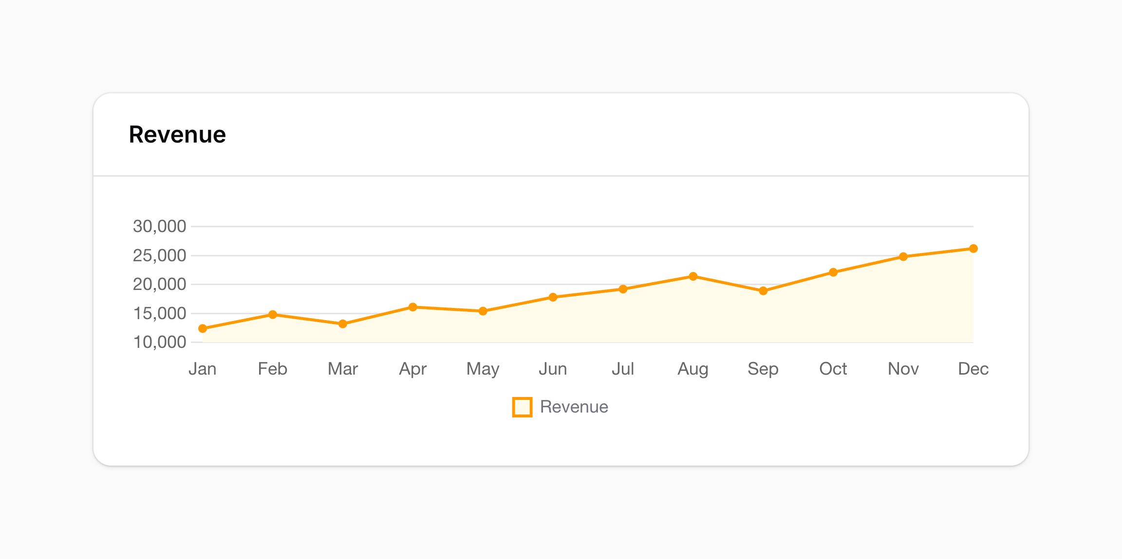
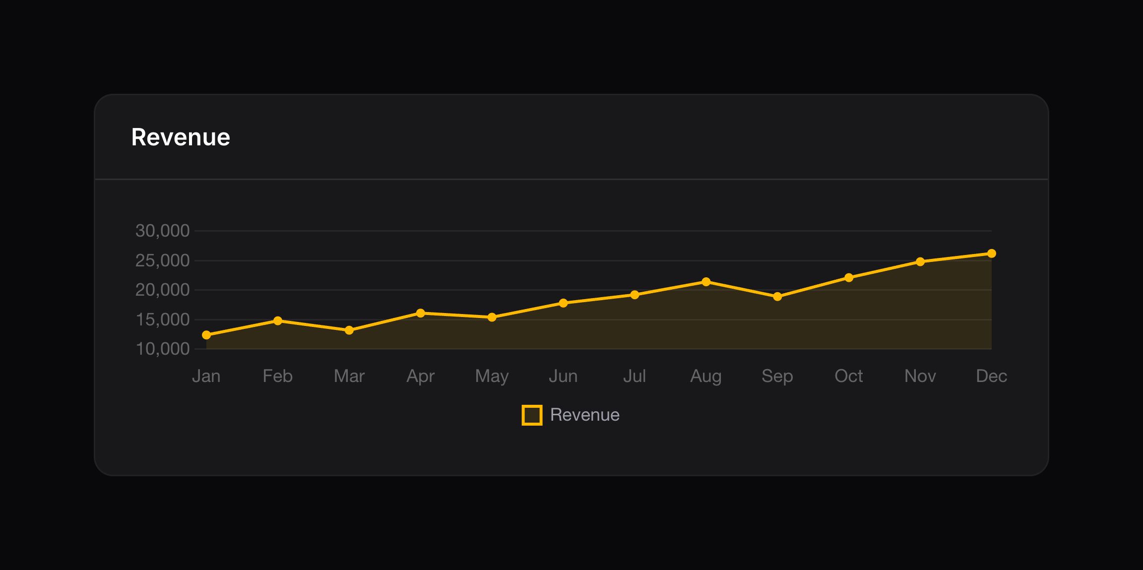
You may place a maximum height on the chart to ensure that it doesn’t get too big, using the $maxHeight property:
protected ?string $maxHeight = '300px';
Setting chart configuration options
You may specify an $options variable on the chart class to control the many configuration options that the Chart.js library provides. For instance, you could turn off the legend for a line chart:
protected ?array $options = [
    'plugins' => [
        'legend' => [
            'display' => false,
        ],
    ],
];
Alternatively, you can override the getOptions() method to return a dynamic array of options:
protected function getOptions(): array
{
    return [
        'plugins' => [
            'legend' => [
                'display' => false,
            ],
        ],
    ];
}
These PHP arrays will get transformed into JSON objects when the chart is rendered. If you want to return raw JavaScript from this method instead, you can return a RawJs object. This is useful if you want to use a JavaScript callback function, for example:
use Filament\Support\RawJs;

protected function getOptions(): RawJs
{
    return RawJs::make(<<<JS
        {
            scales: {
                y: {
                    ticks: {
                        callback: (value) => '€' + value,
                    },
                },
            },
        }
    JS);
}
Styling charts in a theme
Chart.js paints a chart onto a <canvas>, so almost none of it can be reached from a stylesheet. A custom theme is CSS only and cannot call getOptions(), so Filament exposes the parts of a chart that a theme is most likely to want to change as CSS custom properties. You may set them on .fi-wi-chart, or on any element above it to cover every chart in the panel at once:
.fi-wi-chart {
    --chart-border-width: 1;
    --chart-line-tension: 0.4;
    --chart-point-radius: 3;
    --chart-point-style: rect;
    --chart-bar-border-radius: 4;
}
--chart-border-width sets the thickness of the line that a chart draws around its data. --chart-line-tension curves the line of a line chart, from 0 for straight segments up to 1. --chart-point-radius sizes the markers on a line, radar or scatter chart, and --chart-point-style shapes them, accepting any of Chart.js’ point styles - circle, cross, crossRot, dash, line, rect, rectRounded, rectRot, star or triangle - as well as none to hide them entirely. --chart-bar-border-radius rounds the corners of the bars in a bar chart, which are already slightly rounded by default. Set it to 0 for square bars.
These values are handed to Chart.js rather than used by the browser, so they are plain numbers and keywords, without units. If you set one to something Chart.js cannot use, it is ignored and the chart keeps its default. They are also read again whenever the color scheme changes, so you may give light and dark mode different values.
NOTE
These properties are for styling every chart in a panel at once, which is what a theme usually wants. To change a single chart, use getOptions() instead - anything you set there wins over the properties here.
Styling the chart legend
The legend beneath a chart is drawn onto the canvas as well. Two properties control the color swatch next to each label:
.fi-wi-chart {
    --chart-legend-box-width: 16;
    --chart-legend-border-radius: 0;
}
--chart-legend-box-width sets how wide each swatch is, and --chart-legend-border-radius rounds its corners, which are slightly rounded by default to match the bars of a bar chart. Set it to 0 for square swatches.
Styling chart tooltips
The tooltip that appears when hovering over a chart is drawn onto the canvas as well. Its shape comes from two more properties:
.fi-wi-chart {
    --chart-tooltip-corner-radius: 0;
    --chart-tooltip-border-width: 1;
}
Its colors are set differently, so that you can use the same palette and dark mode variants as the rest of your theme. Filament reads them from elements that you style with an ordinary color declaration:
.fi-wi-chart {
    & .fi-wi-chart-tooltip-bg-color {
        @apply text-gray-900 dark:text-white;
    }

    & .fi-wi-chart-tooltip-text-color {
        @apply text-white dark:text-gray-900;
    }

    & .fi-wi-chart-tooltip-border-color {
        @apply text-gray-700 dark:text-gray-200;
    }
}
A tooltip has no border until you give it a width, so --chart-tooltip-border-width and .fi-wi-chart-tooltip-border-color usually change together.
The colors of the chart itself work in the same way: .fi-wi-chart-bg-color and .fi-wi-chart-border-color fill and outline the data, .fi-wi-chart-grid-color draws the grid lines, and .fi-wi-chart-text-color labels the axes.
The small charts inside a stats overview widget are styled separately, with their own set of properties.
Adding a description
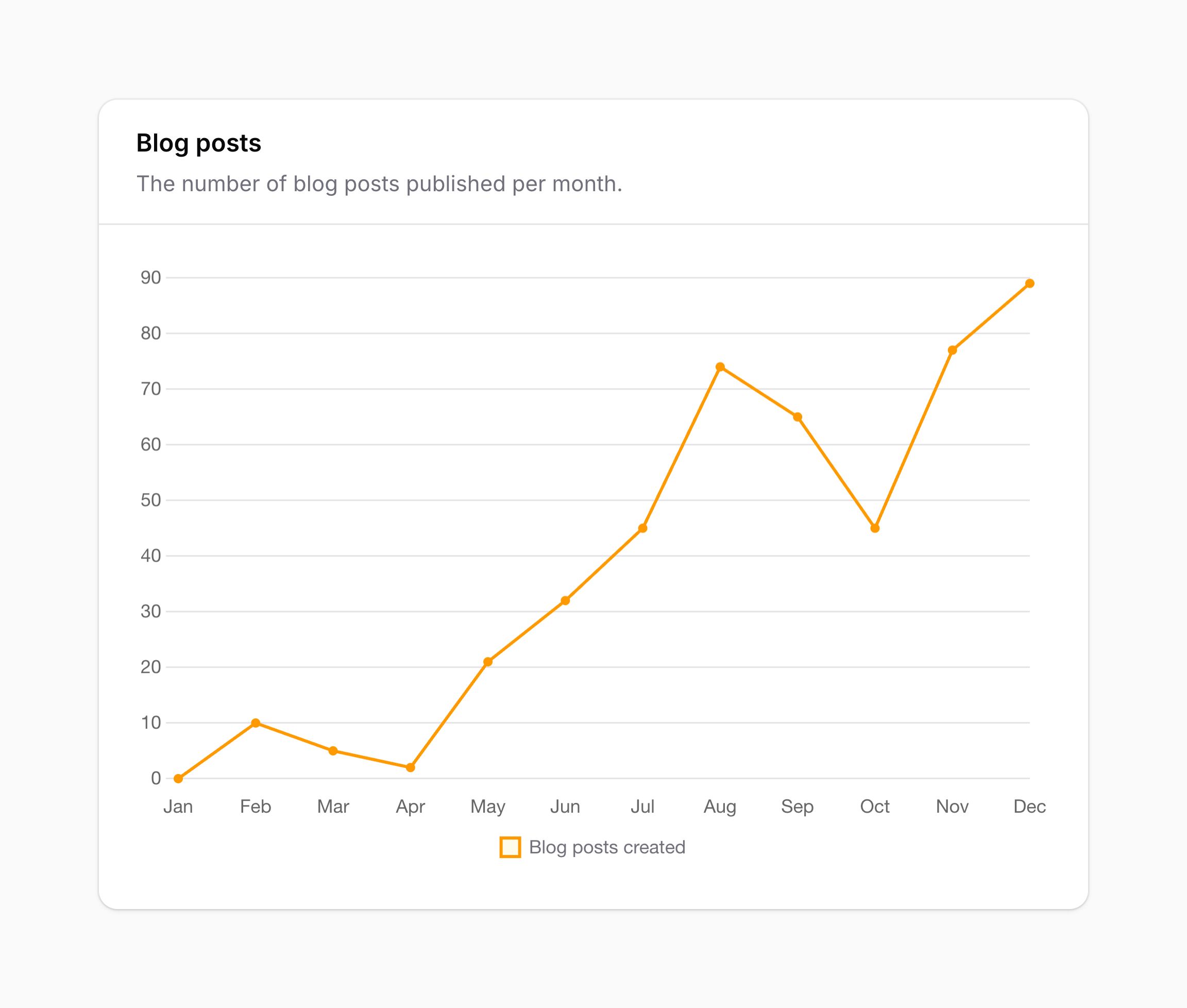
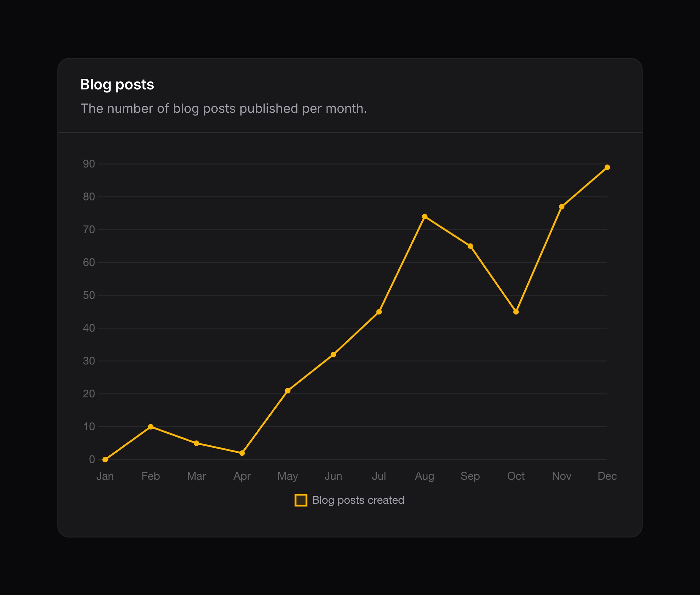
You may add a description, below the heading of the chart, using the getDescription() method:
public function getDescription(): ?string
{
    return 'The number of blog posts published per month.';
}
Disabling lazy loading
By default, widgets are lazy-loaded. This means that they will only be loaded when they are visible on the page.
To disable this behavior, you may override the $isLazy property on the widget class:
protected static bool $isLazy = false;
Making the chart collapsible
You may allow the chart to be collapsible by setting the $isCollapsible property on the widget class to be true:
protected bool $isCollapsible = true;
Using custom Chart.js plugins
Chart.js offers a powerful plugin system that allows you to extend its functionality and create custom chart behaviors. This guide details how to use them in a chart widget.
Step 1: Install the plugin with NPM
To start with, install the plugin using NPM into your project. In this guide, we will install chartjs-plugin-datalabels:
npm install chartjs-plugin-datalabels --save-dev
Step 2: Create a JavaScript file importing the plugin
Create a new JavaScript file where you will define your custom plugin. In this guide, we’ll call it filament-chart-js-plugins.js. Import the plugin, and add it to the window.filamentChartJsPlugins array:
import ChartDataLabels from 'chartjs-plugin-datalabels'

window.filamentChartJsPlugins ??= []
window.filamentChartJsPlugins.push(ChartDataLabels)
This is equivalent to including the plugins “inline” via new Chart(..., { plugins: [...] }) when instantiating a Chart.js chart.
It’s important to initialise the array if it has not been already, before pushing onto it. This ensures that multiple JavaScript files (especially those from Filament plugins) that register Chart.js plugins do not overwrite each other, regardless of the order they are booted in.
You can push as many plugins to the array as you would like to install, you do not need a separate file to import each plugin.
Additionally, you can also register any “global plugins” which will use Chart.register([...]) in the window.filamentChartJsGlobalPlugins array:
import ChartDataLabels from 'chartjs-plugin-datalabels'

window.filamentChartJsGlobalPlugins ??= []
window.filamentChartJsGlobalPlugins.push(ChartDataLabels)
Step 3: Compile the JavaScript file with Vite
Now, you need to build the JavaScript file with Vite, or your bundler of choice. Include the file in your Vite configuration (usually vite.config.js). For example:
import { defineConfig } from 'vite';
import laravel from 'laravel-vite-plugin';

export default defineConfig({
    plugins: [
        laravel({
            input: [
                'resources/css/app.css',
                'resources/js/app.js',
                'resources/css/filament/admin/theme.css',
                'resources/js/filament-chart-js-plugins.js', // Include the new file in the `input` array so it is built
            ],
        }),
    ],
});
Build the file with npm run build.
Step 4: Register the JavaScript file in Filament
Filament needs to know to include this JavaScript file when rendering chart widgets. You can do this in the boot() method of a service provider like AppServiceProvider:
use Filament\Support\Assets\Js;
use Filament\Support\Facades\FilamentAsset;
use Illuminate\Support\Facades\Vite;

FilamentAsset::register([
    Js::make('chart-js-plugins', Vite::asset('resources/js/filament-chart-js-plugins.js'))->module(),
]);
You can find out more about asset registration, and even register assets for a specific panel.
Edit on GitHubStill need help? Join our Discord community or open a GitHub discussion