Actions
Modals
Overview
Actions may require additional confirmation or input from the user before they run. You may open a modal before an action is executed to do this.
Confirmation modals
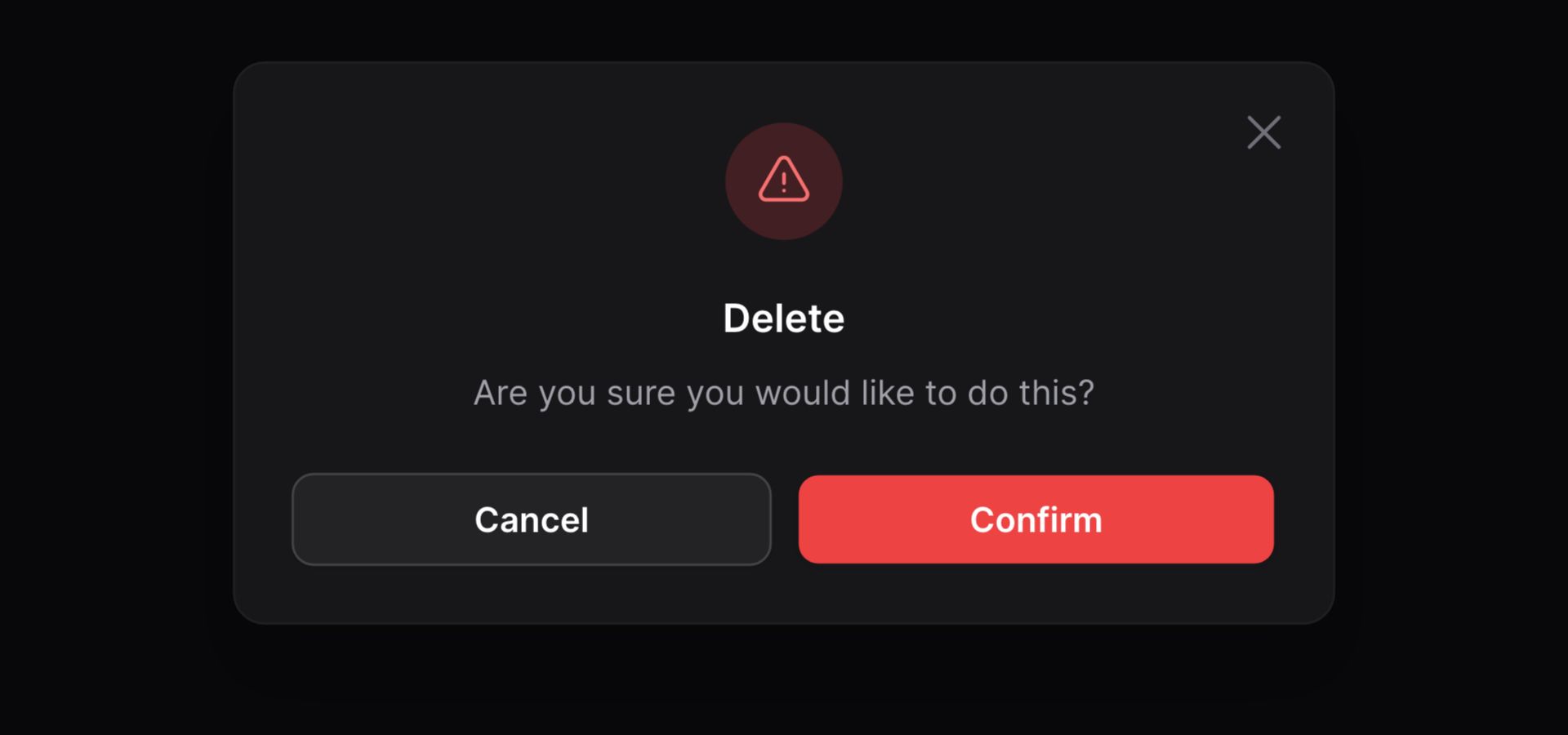
You may require confirmation before an action is run using the requiresConfirmation() method. This is useful for particularly destructive actions, such as those that delete records.
use App\Models\Post; Action::make('delete') ->action(fn (Post $record) => $record->delete()) ->requiresConfirmation()
The confirmation modal is not available when a
url()is set instead of anaction(). Instead, you should redirect to the URL within theaction()closure.
Modal forms
You may also render a form in the modal to collect extra information from the user before the action runs.
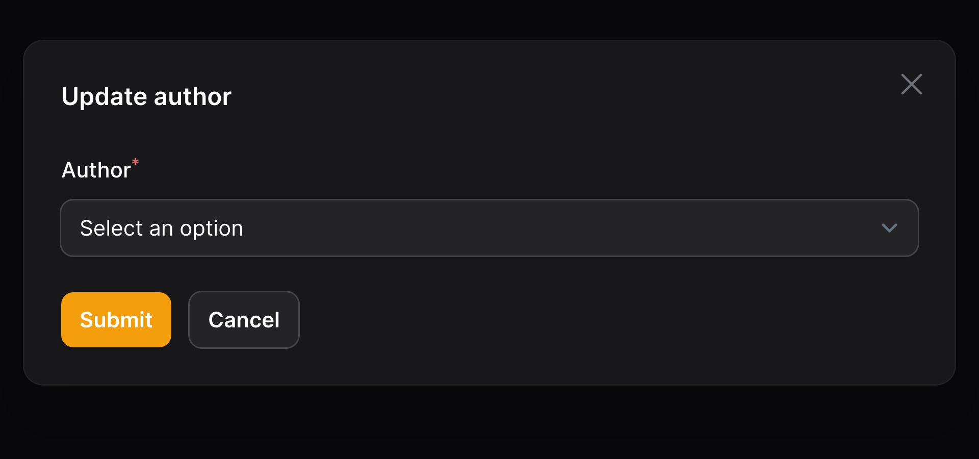
You may use components from the Form Builder to create custom action modal forms. The data from the form is available in the $data array of the action() closure:
use App\Models\Post;use App\Models\User;use Filament\Forms\Components\Select; Action::make('updateAuthor') ->form([ Select::make('authorId') ->label('Author') ->options(User::query()->pluck('name', 'id')) ->required(), ]) ->action(function (array $data, Post $record): void { $record->author()->associate($data['authorId']); $record->save(); })
Filling the form with existing data
You may fill the form with existing data, using the fillForm() method:
use App\Models\Post;use App\Models\User;use Filament\Forms\Components\Select;use Filament\Forms\Form; Action::make('updateAuthor') ->fillForm(fn (Post $record): array => [ 'authorId' => $record->author->id, ]) ->form([ Select::make('authorId') ->label('Author') ->options(User::query()->pluck('name', 'id')) ->required(), ]) ->action(function (array $data, Post $record): void { $record->author()->associate($data['authorId']); $record->save(); })Using a wizard as a modal form
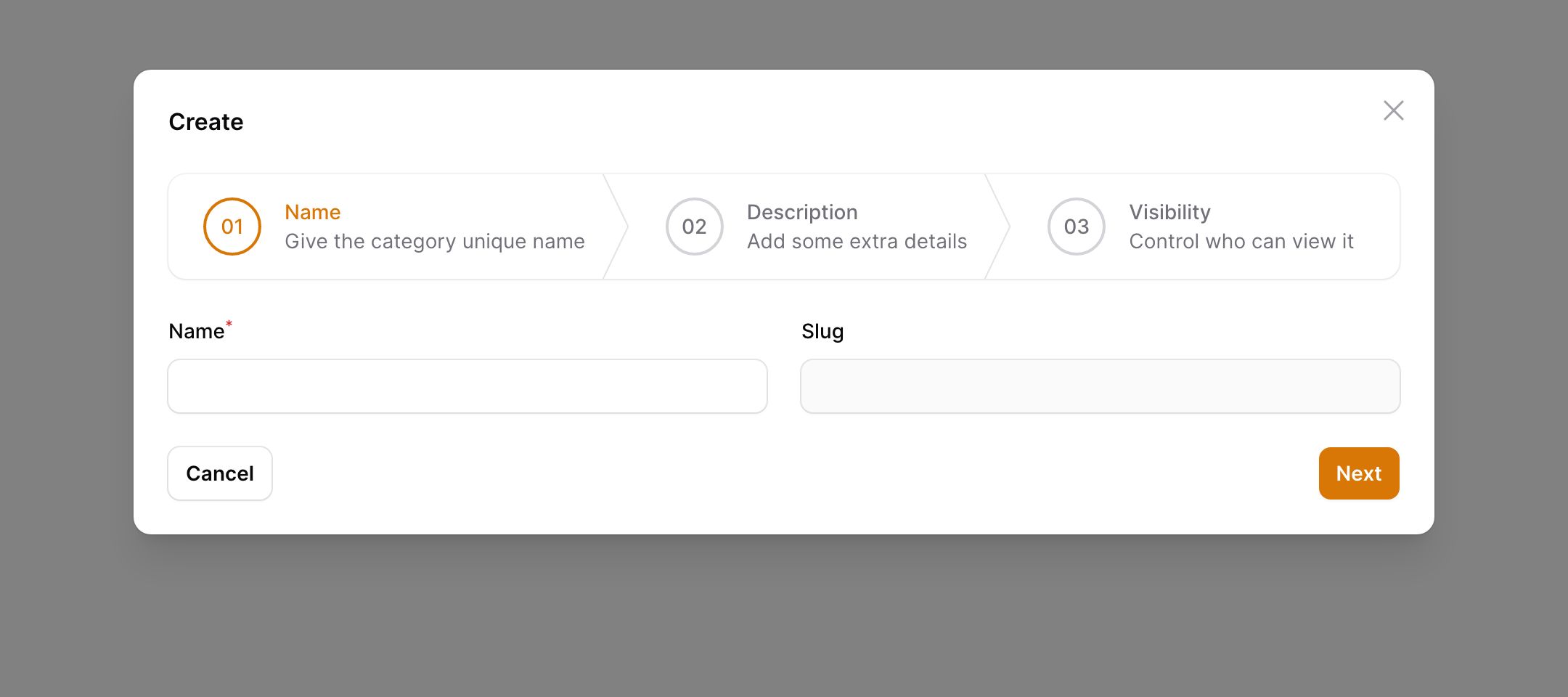
You may create a multistep form wizard inside a modal. Instead of using a form(), define a steps() array and pass your Step objects:
use Filament\Forms\Components\MarkdownEditor;use Filament\Forms\Components\TextInput;use Filament\Forms\Components\Toggle;use Filament\Forms\Components\Wizard\Step; Action::make('create') ->steps([ Step::make('Name') ->description('Give the category a unique name') ->schema([ TextInput::make('name') ->required() ->live() ->afterStateUpdated(fn ($state, callable $set) => $set('slug', Str::slug($state))), TextInput::make('slug') ->disabled() ->required() ->unique(Category::class, 'slug'), ]) ->columns(2), Step::make('Description') ->description('Add some extra details') ->schema([ MarkdownEditor::make('description'), ]), Step::make('Visibility') ->description('Control who can view it') ->schema([ Toggle::make('is_visible') ->label('Visible to customers.') ->default(true), ]), ])
Disabling all form fields
You may wish to disable all form fields in the modal, ensuring the user cannot edit them. You may do so using the disabledForm() method:
use App\Models\Post;use App\Models\User;use Filament\Forms\Components\Textarea;use Filament\Forms\Components\TextInput; Action::make('approvePost') ->form([ TextInput::make('title'), Textarea::make('content'), ]) ->fillForm(fn (Post $record): array => [ 'title' => $record->title, 'content' => $record->content, ]) ->disabledForm() ->action(function (Post $record): void { $record->approve(); })Customizing the modal's heading, description, and submit action label
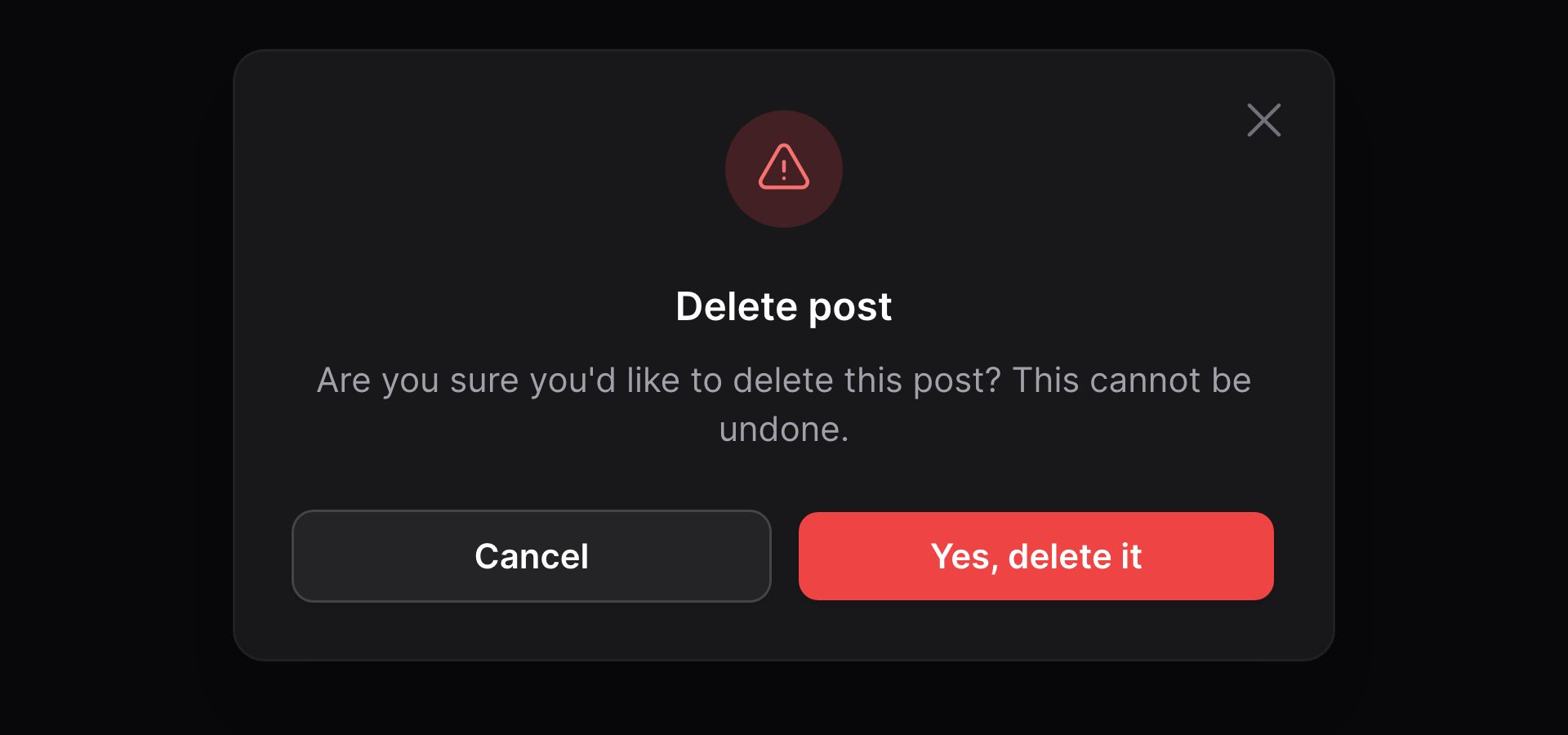
You may customize the heading, description and label of the submit button in the modal:
use App\Models\Post; Action::make('delete') ->action(fn (Post $record) => $record->delete()) ->requiresConfirmation() ->modalHeading('Delete post') ->modalDescription('Are you sure you\'d like to delete this post? This cannot be undone.') ->modalSubmitActionLabel('Yes, delete it')
Adding an icon inside the modal
You may add an icon inside the modal using the modalIcon() method:
use App\Models\Post; Action::make('delete') ->action(fn (Post $record) => $record->delete()) ->requiresConfirmation() ->modalIcon('heroicon-o-trash')By default, the icon will inherit the color of the action button. You may customize the color of the icon using the modalIconColor() method:
use App\Models\Post; Action::make('delete') ->action(fn (Post $record) => $record->delete()) ->requiresConfirmation() ->color('danger') ->modalIcon('heroicon-o-trash') ->modalIconColor('warning')Customizing the alignment of modal content
By default, modal content will be aligned to the start, or centered if the modal is xs or sm in width. If you wish to change the alignment of content in a modal, you can use the modalAlignment() method and pass it Alignment::Start or Alignment::Center:
use Filament\Support\Enums\Alignment; Action::make('updateAuthor') ->form([ // ... ]) ->action(function (array $data): void { // ... }) ->modalAlignment(Alignment::Center)Custom modal content
You may define custom content to be rendered inside your modal, which you can specify by passing a Blade view into the modalContent() method:
use App\Models\Post; Action::make('advance') ->action(fn (Post $record) => $record->advance()) ->modalContent(view('filament.pages.actions.advance'))Passing data to the custom modal content
You can pass data to the view by returning it from a function. For example, if the $record of an action is set, you can pass that through to the view:
use Illuminate\Contracts\View\View; Action::make('advance') ->action(fn (Contract $record) => $record->advance()) ->modalContent(fn (Contract $record): View => view( 'filament.pages.actions.advance', ['record' => $record], ))Adding custom modal content below the form
By default, the custom content is displayed above the modal form if there is one, but you can add content below using modalContentFooter() if you wish:
use App\Models\Post; Action::make('advance') ->action(fn (Post $record) => $record->advance()) ->modalContentFooter(view('filament.pages.actions.advance'))Adding an action to custom modal content
You can add an action button to your custom modal content, which is useful if you want to add a button that performs an action other than the main action. You can do this by registering an action with the registerModalActions() method, and then passing it to the view:
use App\Models\Post;use Illuminate\Contracts\View\View; Action::make('advance') ->registerModalActions([ Action::make('report') ->requiresConfirmation() ->action(fn (Post $record) => $record->report()), ]) ->action(fn (Post $record) => $record->advance()) ->modalContent(fn (Action $action): View => view( 'filament.pages.actions.advance', ['action' => $action], ))Now, in the view file, you can render the action button by calling getModalAction():
<div> {{ $action->getModalAction('report') }}</div>Using a slide-over instead of a modal
You can open a "slide-over" dialog instead of a modal by using the slideOver() method:
Action::make('updateAuthor') ->form([ // ... ]) ->action(function (array $data): void { // ... }) ->slideOver()
Instead of opening in the center of the screen, the modal content will now slide in from the right and consume the entire height of the browser.
Making the modal header sticky
The header of a modal scrolls out of view with the modal content when it overflows the modal size. However, slide-overs have a sticky header that's always visible. You may control this behavior using stickyModalHeader():
Action::make('updateAuthor') ->form([ // ... ]) ->action(function (array $data): void { // ... }) ->stickyModalHeader()Making the modal footer sticky
The footer of a modal is rendered inline after the content by default. Slide-overs, however, have a sticky footer that always shows when scrolling the content. You may enable this for a modal too using stickyModalFooter():
Action::make('updateAuthor') ->form([ // ... ]) ->action(function (array $data): void { // ... }) ->stickyModalFooter()Changing the modal width
You can change the width of the modal by using the modalWidth() method. Options correspond to Tailwind's max-width scale. The options are ExtraSmall, Small, Medium, Large, ExtraLarge, TwoExtraLarge, ThreeExtraLarge, FourExtraLarge, FiveExtraLarge, SixExtraLarge, SevenExtraLarge, and Screen:
use Filament\Support\Enums\MaxWidth; Action::make('updateAuthor') ->form([ // ... ]) ->action(function (array $data): void { // ... }) ->modalWidth(MaxWidth::FiveExtraLarge)Executing code when the modal opens
You may execute code within a closure when the modal opens, by passing it to the mountUsing() method:
use Filament\Forms\Form; Action::make('create') ->mountUsing(function (Form $form) { $form->fill(); // ... })The
mountUsing()method, by default, is used by Filament to initialize the form. If you override this method, you will need to call$form->fill()to ensure the form is initialized correctly. If you wish to populate the form with data, you can do so by passing an array to thefill()method, instead of usingfillForm()on the action itself.
Customizing the action buttons in the footer of the modal
By default, there are two actions in the footer of a modal. The first is a button to submit, which executes the action(). The second button closes the modal and cancels the action.
Modifying a default modal footer action button
To modify the action instance that is used to render one of the default action buttons, you may pass a closure to the modalSubmitAction() and modalCancelAction() methods:
use Filament\Actions\StaticAction; Action::make('help') ->modalContent(view('actions.help')) ->modalCancelAction(fn (StaticAction $action) => $action->label('Close'))The methods available to customize trigger buttons will work to modify the $action instance inside the closure.
Removing a default modal footer action button
To remove a default action, you may pass false to either modalSubmitAction() or modalCancelAction():
Action::make('help') ->modalContent(view('actions.help')) ->modalSubmitAction(false)Adding an extra modal action button to the footer
You may pass an array of extra actions to be rendered, between the default actions, in the footer of the modal using the extraModalFooterActions() method:
Action::make('create') ->form([ // ... ]) // ... ->extraModalFooterActions(fn (Action $action): array => [ $action->makeModalSubmitAction('createAnother', arguments: ['another' => true]), ])$action->makeModalSubmitAction() returns an action instance that can be customized using the methods available to customize trigger buttons.
The second parameter of makeModalSubmitAction() allows you to pass an array of arguments that will be accessible inside the action's action() closure as $arguments. These could be useful as flags to indicate that the action should behave differently based on the user's decision:
Action::make('create') ->form([ // ... ]) // ... ->extraModalFooterActions(fn (Action $action): array => [ $action->makeModalSubmitAction('createAnother', arguments: ['another' => true]), ]) ->action(function (array $data, array $arguments): void { // Create if ($arguments['another'] ?? false) { // Reset the form and don't close the modal } })Opening another modal from an extra footer action
You can nest actions within each other, allowing you to open a new modal from an extra footer action:
Action::make('edit') // ... ->extraModalFooterActions([ Action::make('delete') ->requiresConfirmation() ->action(function () { // ... }), ])Now, the edit modal will have a "Delete" button in the footer, which will open a confirmation modal when clicked. This action is completely independent of the edit action, and will not run the edit action when it is clicked.
In this example though, you probably want to cancel the edit action if the delete action is run. You can do this using the cancelParentActions() method:
Action::make('delete') ->requiresConfirmation() ->action(function () { // ... }) ->cancelParentActions()If you have deep nesting with multiple parent actions, but you don't want to cancel all of them, you can pass the name of the parent action you want to cancel, including its children, to cancelParentActions():
Action::make('first') ->requiresConfirmation() ->action(function () { // ... }) ->extraModalFooterActions([ Action::make('second') ->requiresConfirmation() ->action(function () { // ... }) ->extraModalFooterActions([ Action::make('third') ->requiresConfirmation() ->action(function () { // ... }) ->extraModalFooterActions([ Action::make('fourth') ->requiresConfirmation() ->action(function () { // ... }) ->cancelParentActions('second'), ]), ]), ])In this example, if the fourth action is run, the second action is canceled, but so is the third action since it is a child of second. The first action is not canceled, however, since it is the parent of second. The first action's modal will remain open.
Closing the modal by clicking away
By default, when you click away from a modal, it will close itself. If you wish to disable this behavior for a specific action, you can use the closeModalByClickingAway(false) method:
Action::make('updateAuthor') ->form([ // ... ]) ->action(function (array $data): void { // ... }) ->closeModalByClickingAway(false)If you'd like to change the behavior for all modals in the application, you can do so by calling Modal::closedByClickingAway() inside a service provider or middleware:
use Filament\Support\View\Components\Modal; Modal::closedByClickingAway(false);Closing the modal by escaping
By default, when you press escape on a modal, it will close itself. If you wish to disable this behavior for a specific action, you can use the closeModalByEscaping(false) method:
Action::make('updateAuthor') ->form([ // ... ]) ->action(function (array $data): void { // ... }) ->closeModalByEscaping(false)If you'd like to change the behavior for all modals in the application, you can do so by calling Modal::closedByEscaping() inside a service provider or middleware:
use Filament\Support\View\Components\Modal; Modal::closedByEscaping(false);Hiding the modal close button
By default, modals have a close button in the top right corner. If you wish to hide the close button, you can use the modalCloseButton(false) method:
Action::make('updateAuthor') ->form([ // ... ]) ->action(function (array $data): void { // ... }) ->modalCloseButton(false)If you'd like to hide the close button for all modals in the application, you can do so by calling Modal::closeButton(false) inside a service provider or middleware:
use Filament\Support\View\Components\Modal; Modal::closeButton(false);Preventing the modal from autofocusing
By default, modals will autofocus on the first focusable element when opened. If you wish to disable this behavior, you can use the modalAutofocus(false) method:
Action::make('updateAuthor') ->form([ // ... ]) ->action(function (array $data): void { // ... }) ->modalAutofocus(false)If you'd like to disable autofocus for all modals in the application, you can do so by calling Modal::autofocus(false) inside a service provider or middleware:
use Filament\Support\View\Components\Modal; Modal::autofocus(false);Optimizing modal configuration methods
When you use database queries or other heavy operations inside modal configuration methods like modalHeading(), they can be executed more than once. This is because Filament uses these methods to decide whether to render the modal or not, and also to render the modal's content.
To skip the check that Filament does to decide whether to render the modal, you can use the modal() method, which will inform Filament that the modal exists for this action and it does not need to check again:
Action::make('updateAuthor') ->modal()Conditionally hiding the modal
You may have a need to conditionally show a modal for confirmation reasons while falling back to the default action. This can be achieved using modalHidden():
Action::make('create') ->action(function (array $data): void { // ... }) ->modalHidden(fn (): bool => $this->role !== 'admin') ->modalContent(view('filament.pages.actions.create'))Adding extra attributes to the modal window
You may also pass extra HTML attributes to the modal window using extraModalWindowAttributes():
Action::make('updateAuthor') ->extraModalWindowAttributes(['class' => 'update-author-modal'])Still need help? Join our Discord community or open a GitHub discussion


